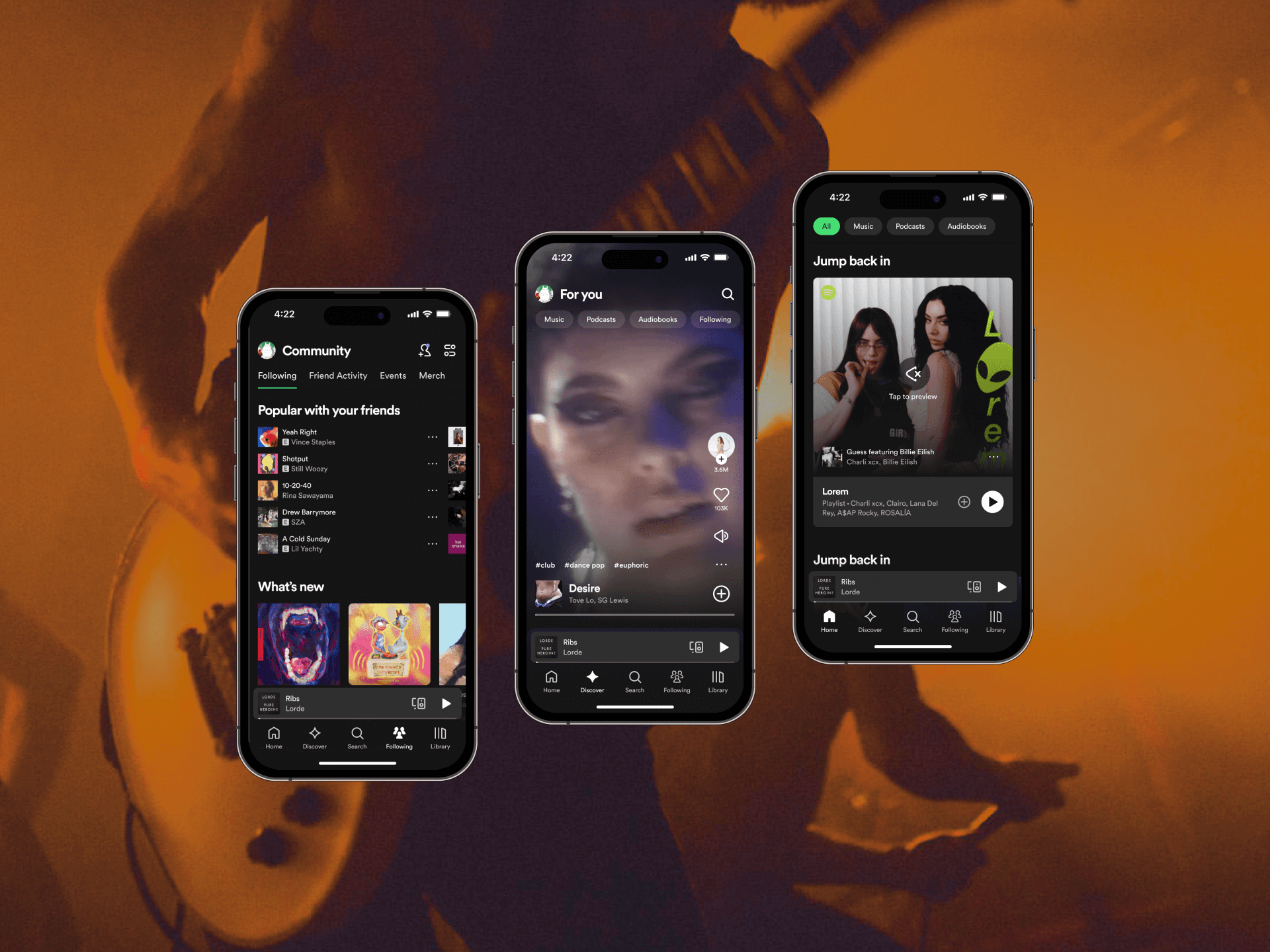
Designing a mobile app for Cimu, which connects online shoppers to tailors for clothing alterations.❦
I spent four months as a contracted product designer creating an end-to-end user experience for Cimu’s mobile tailor-facing app, which allowed tailors to efficiently manage incoming appointments and pickups and for Cimu to operate on a larger scale.
Disciplines
- Product Design
- Identity
- Mobile
With
- Alana Liu
- Kaci Xie
- Zepto Zhou
Timeline
4 months, Oct 2023–Jan 2024
Overview
Returning clothes online costs companies billions of dollars and contributes to climate pollution.
Cimu is a start-up that offers a new alternative to clothing returns. When Cimu users accidentally buy an ill-fitting outfit, they will be connected to a local tailor to get their clothing altered to the perfect size. Consumers can keep the clothes they like, companies save money, and pollution is reduced.
Similar to companies like Doordash and Uber, Cimu had started as a promising business that operated on a local scale. Now that they knew the idea had potential, they needed to scale their framework to accommodate a much larger audience. This is where my team and I came in.
"Right now, Cimu is in its pilot phase, and we're manually scheduling appointments between online shoppers and tailors through phone calls and emails. It’s inefficient even on a local scale, and we need an app to help us expand."
—from our brief with Kaci, Cimu’s CEO
Problem
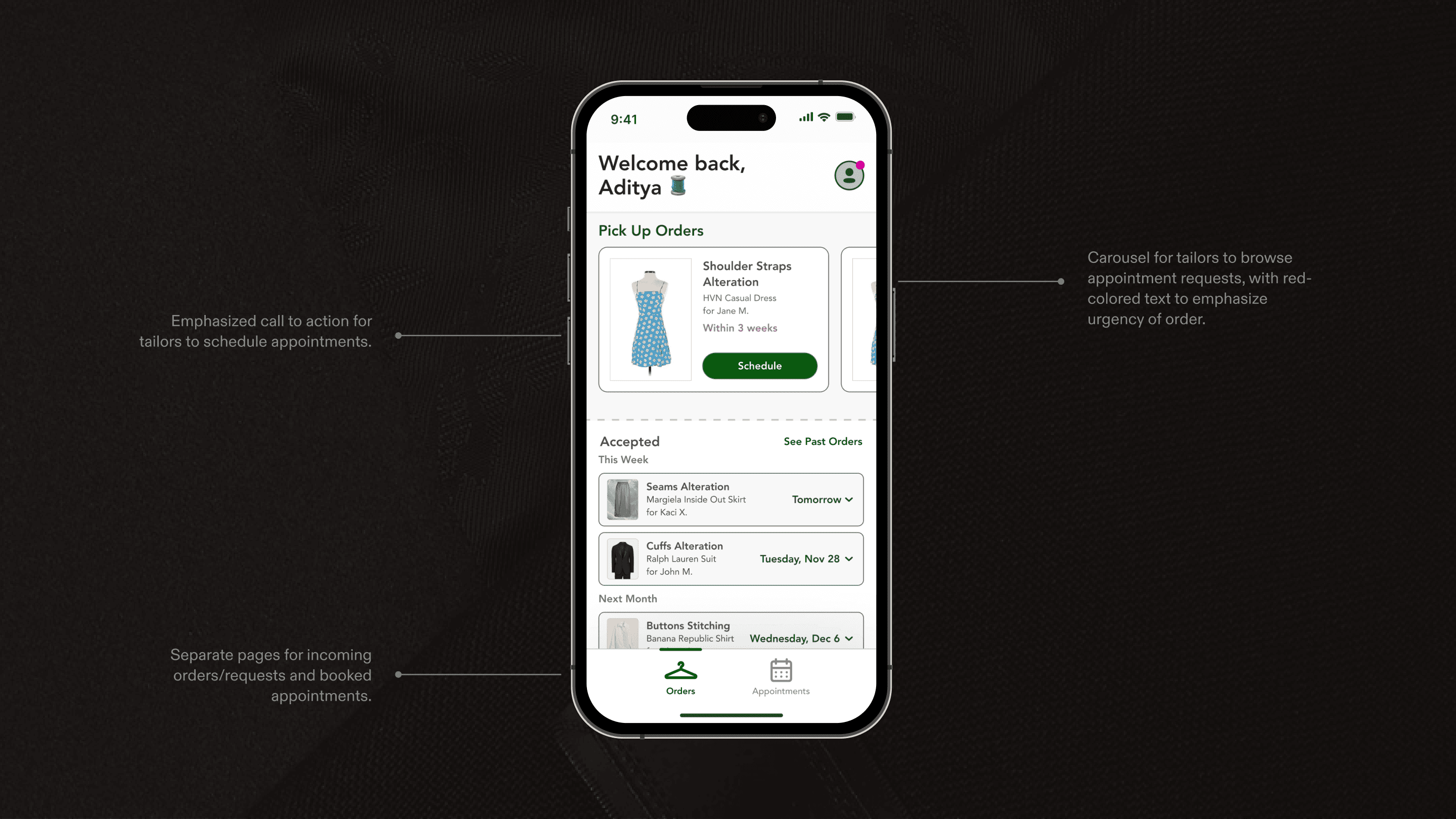
Appointment booking is complicated and inefficient.
To better understand all how Cimu was currently scheduling appointments in its pilot phase, I sat in with Kaci—Cimu's CEO—as she set up appointments between tailors and their clients. Here are the prominent painpoints I noticed.
It was difficult to match tailor and customer availabilities.
For Kaci to match availability, she needed at least two separate phone calls/emails, which created a lot of unecessary friction and delay in the scheduling process. To make matters worse, rescheduling would restart this tedious process all over again.
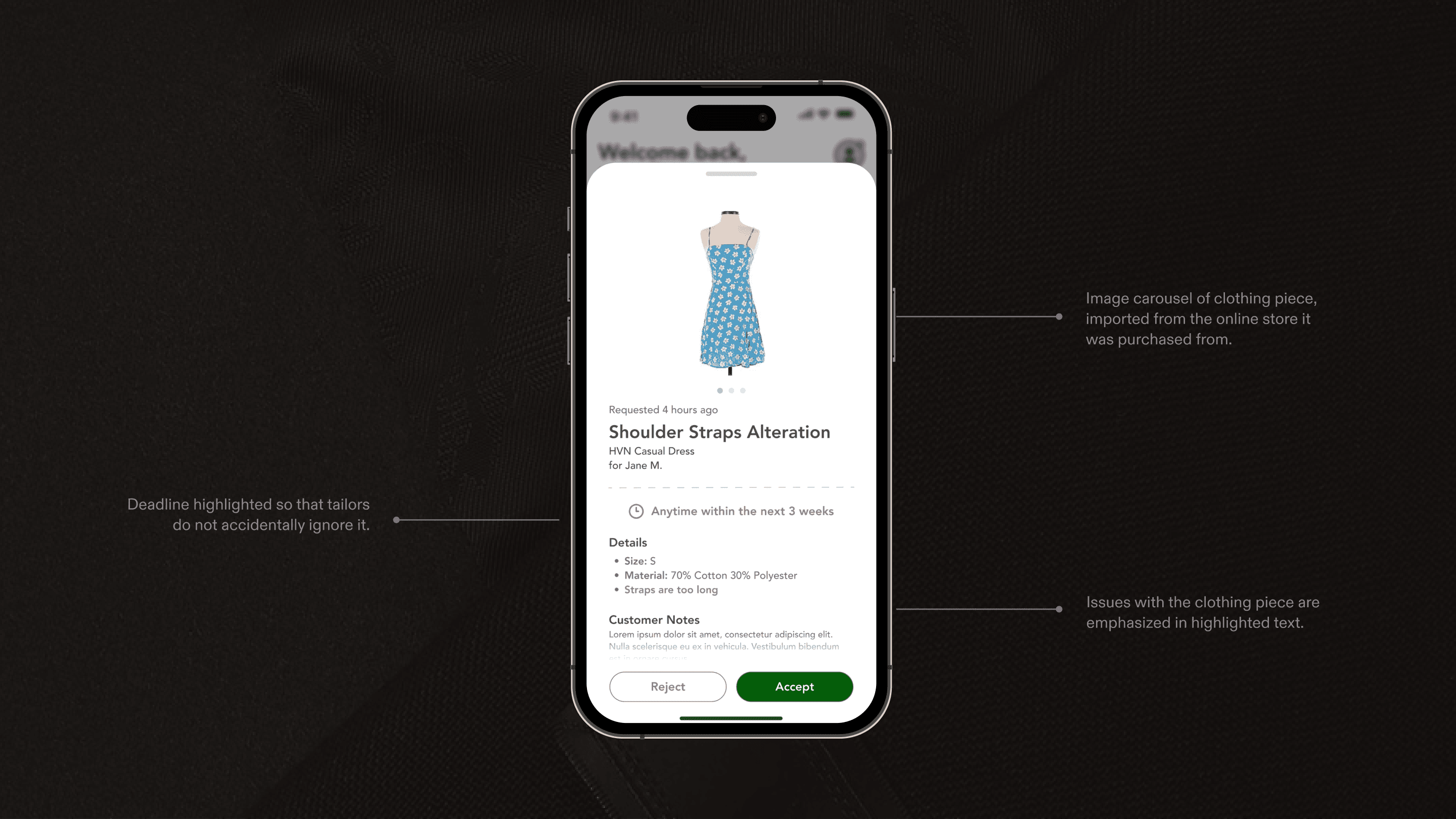
Tailors didn't have much prior knowledge about the appointment.
Since tailors didn't know about the clothing and type of alteration they would be doing prior to the appointment, client appointments would take longer so that they could get proper measurements. In one worst-case scenario, this led a tailor to botch an alteration.
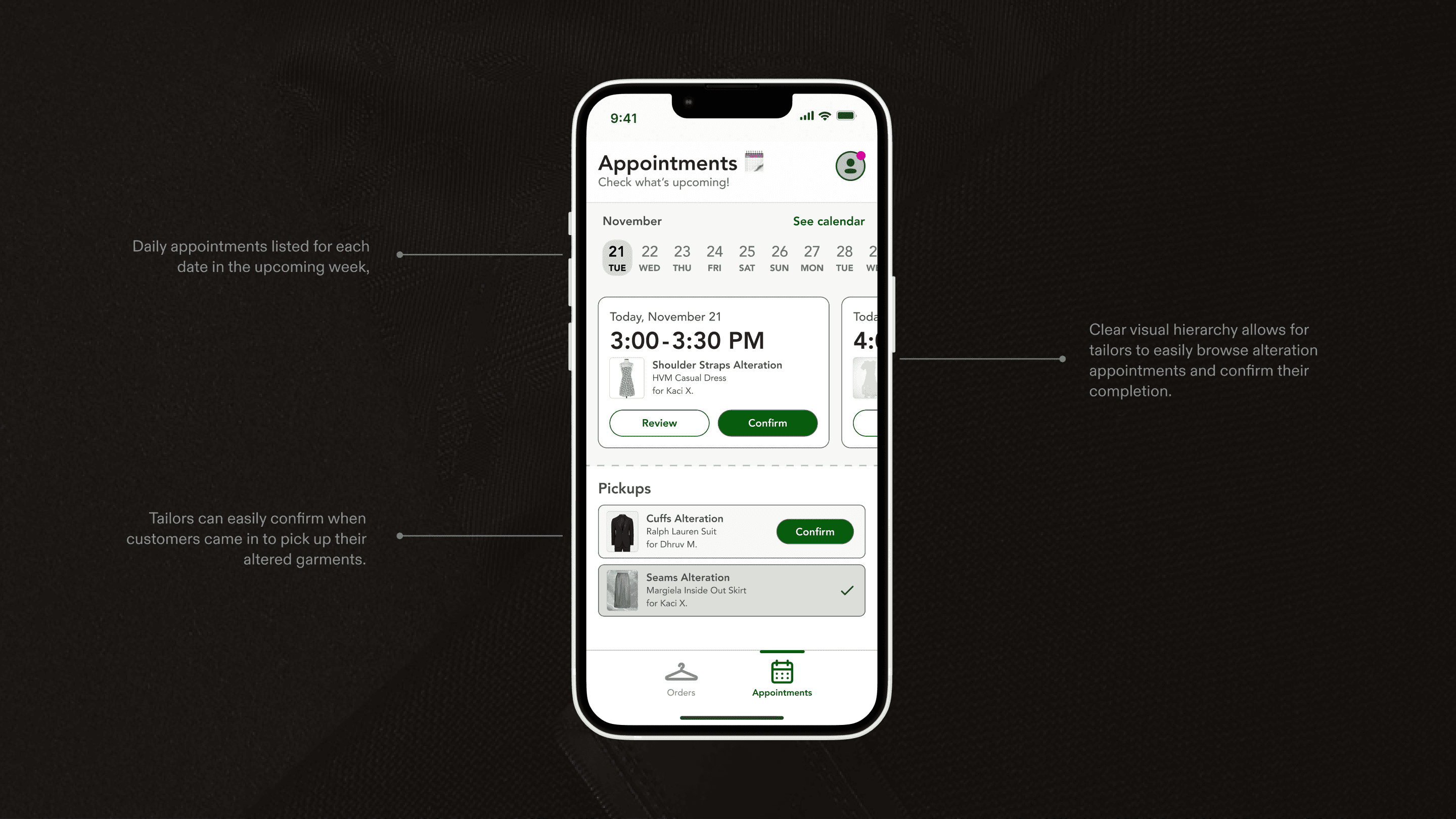
Clothing pickups happened asynchronously, making it difficult for Cimu to verify appointment completion.
Kaci oftentimes didn't know when a clothing alteration was actually complete, since garments were picked up from the tailor at the customer's convenience, not through an official appointment.
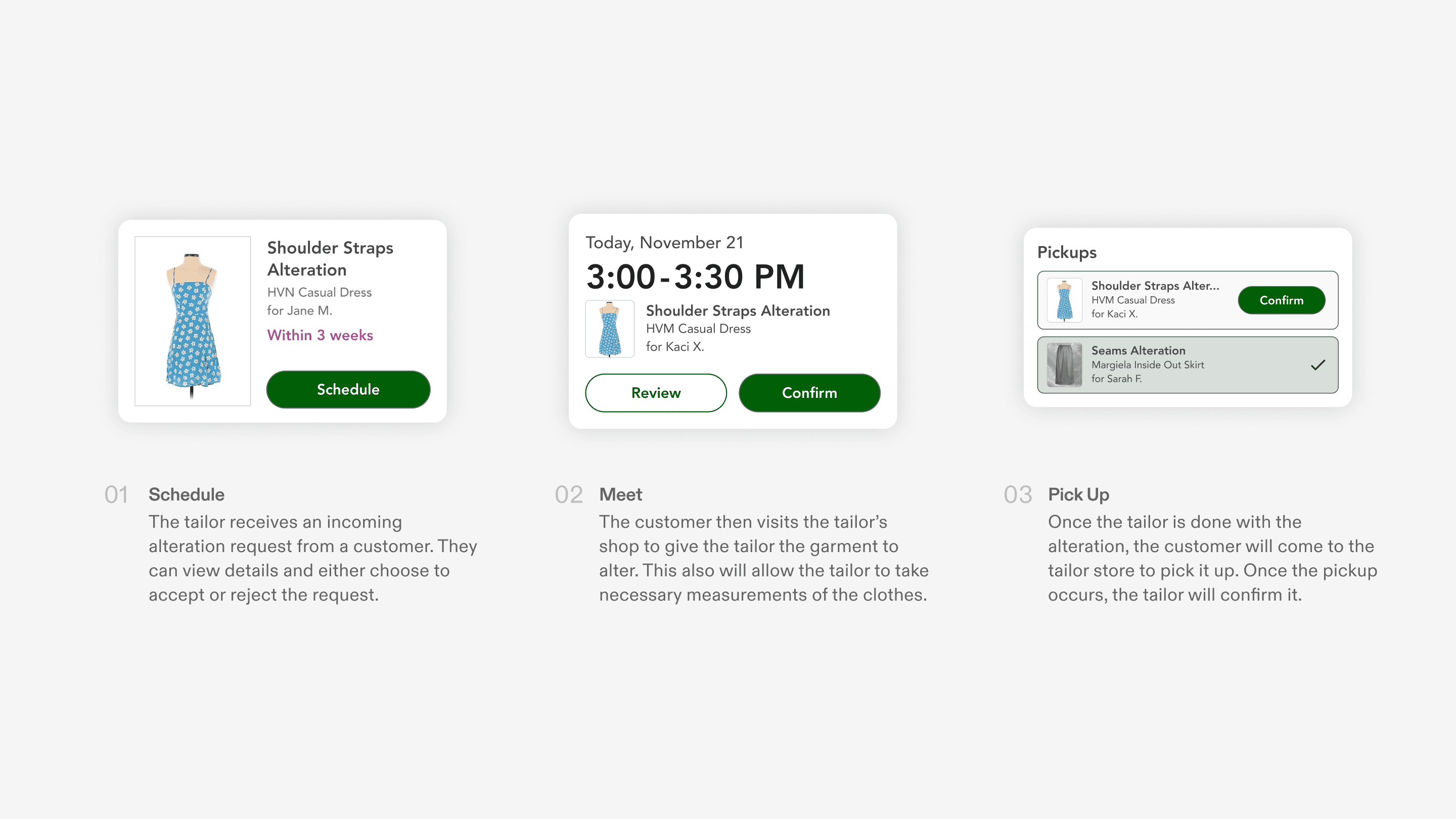
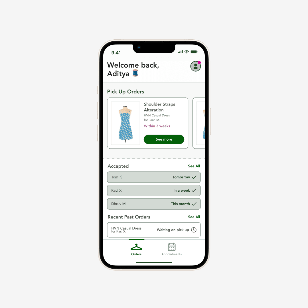
Above
A simple way to schedule appointments that dealt with the three major pain points that I uncovered.
I drafted an efficient appointment scheduling flow that targeted the pain points that Cimu faced when manually scheduling appointments.
I determined that scheduling and pickup scheduling can be done asynchronously through an app; tailors and customers could give availabilities and be matched through the app instead of scheduling via phone call. This would streamline order management for tailors, and for Cimu as well!
Research & Goal
85% of tailors are over 45 years old, and many of them speak English as a second language.
This information is based in demographic studies and Cimu's own recorded data. Many of these app's users belonged to marginalized communities in society.
This led to a major question: how could we ensure that this app equitably accommodated its users?
Goal #1: Use consistent design language and concise copy for users with Limited English Proficiency (LEP).
To do this, we created a detailed low-fidelity prototype and design library that ensured consistent states for all components in the app. We also did a lot of workshopping to ensure that all screens were as easily digestible as possible (more on this soon), and that the text was comprehensive for users that spoke English as a second language.
Goal #2: Avoid overcomplication at all costs. Clarity was key!
This meant designing the app to be as linear as possible, and that onboarding flows and the like should be divided into short, simple steps to avoid unnecessary confusion. We also designed various pop-up tutorials that would help guide users through the interface. What's the saying... teach a man to fish?
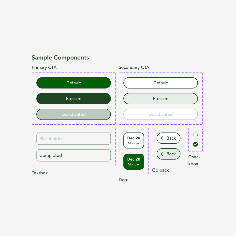
Above
Some components from our design library.
Prioritize equity-driven design to maintain accessibility for Cimu's predominantly middle-aged, LEP user base.
—Our north star ☆
With a clear picture of our users (and goal) in mind, I had to rework Cimu's brand kit.
I quickly realized that our north star objective—intuitive, accessible, and consistent design—wouldn't be possible to achieve within the current restraints of Cimu's brand kit.
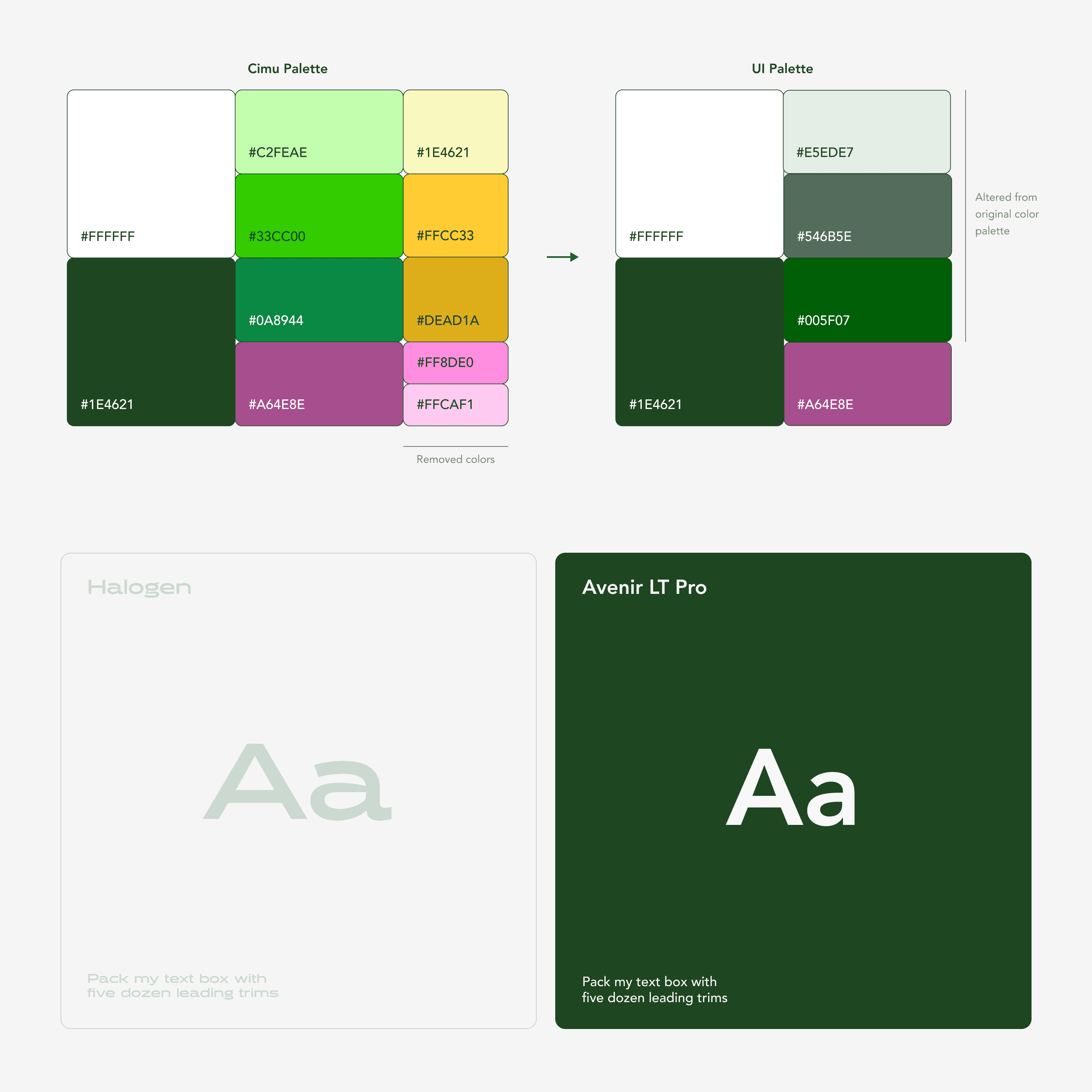
I tweaked Cimu's color palette to fit standard contrast guidelines.
Cimu’s original brand kit was bright and colorful, but the colors were too saturated to include in an interface that was trying to accommodate older users. I desaturated the three green midtones to make them less abrasive and increased the contrast to improve readability. I also removed colors from the original brand kit in order to not overcomplicate the app’s visual language.
I removed any typefaces that affected the interface's readability.
Cimu’s original brand kit included two typefaces: Halogen and Avenir. However, since we were designing for users that had limited English proficiency, I decided not to use Halogen at all in the app. Instead, I opted to use the more standard typeface, Avenir, for the entire UI, to prioritize readability and accessibility.
Above
A before and after of Cimu's color and type kits.
Process
Setting up Cimu's information architecture.
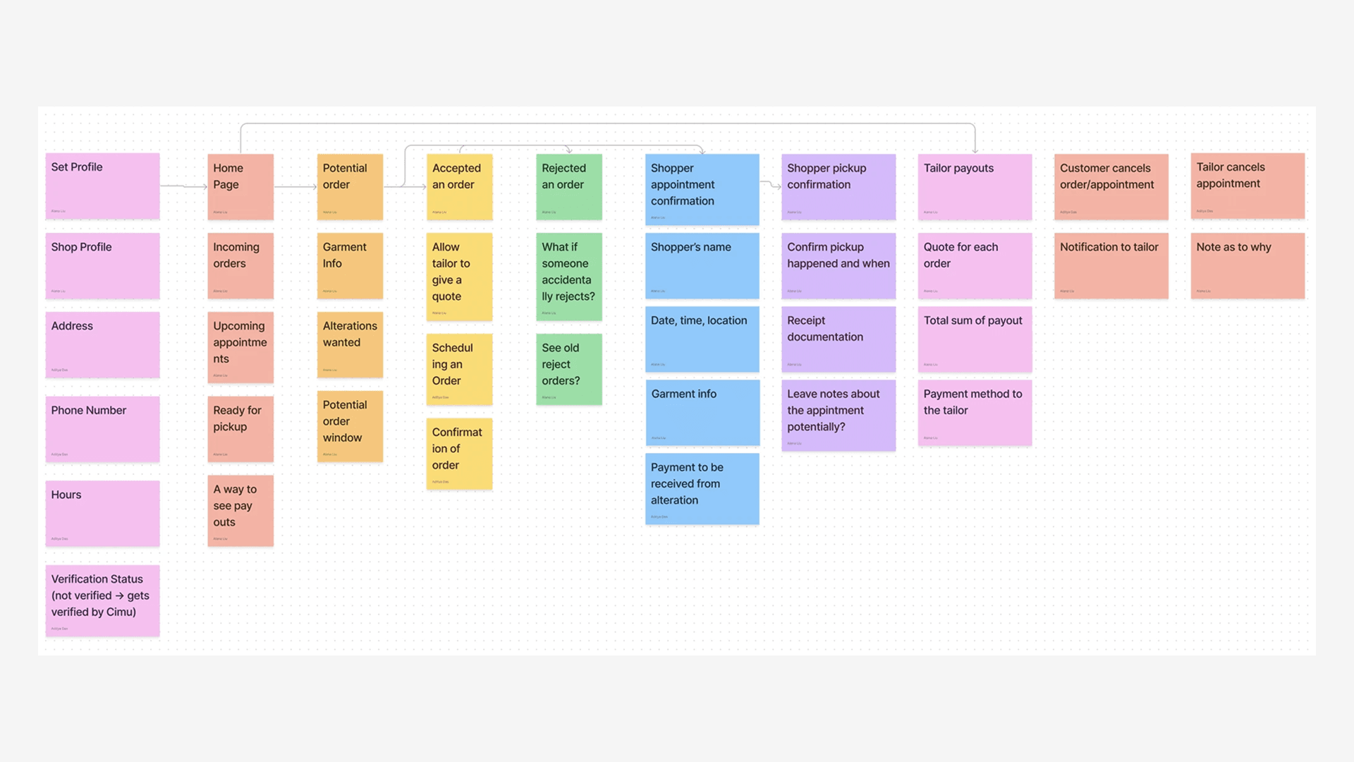
With this goal in mind (and a tricky problem out of the way), I got to work structuring the app. This proved challenging, because it turned out that there was a lot of information that we could potentially display on the homepage.
Above
A potential user journey through the app.
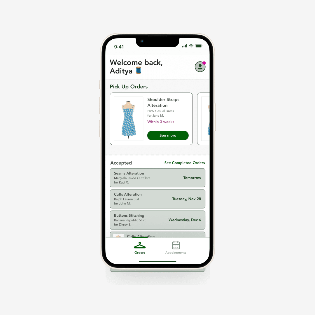
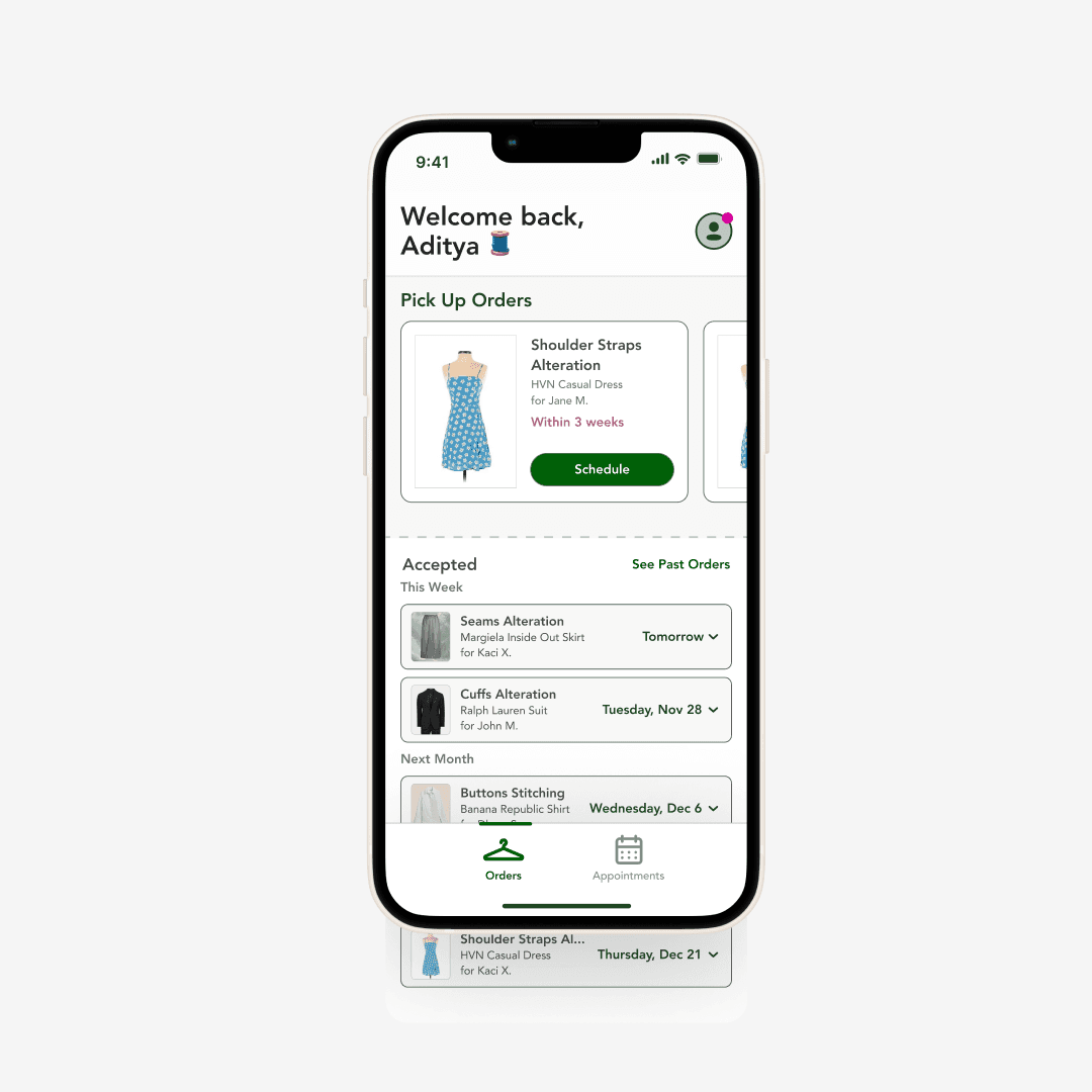
I rapidly iterated through various low-fidelity prototypes of the homepage, and slowly refined it again and again throughout the project. Throughout the process, we showed our prototypes to a handful of local tailors to ensure that we were staying true to our goals.
/
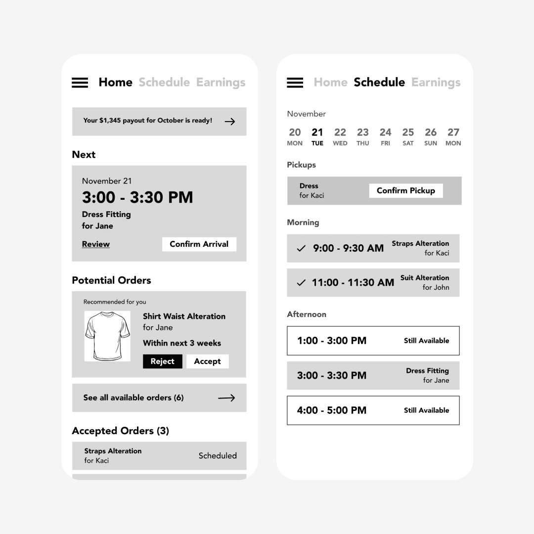
v1: A general dashboard and calendar layout. There's a clear schedule view, but all of the other types of content blend together. Ultimately, the homepage ended up looking very crowded.
1 of 6
Solution
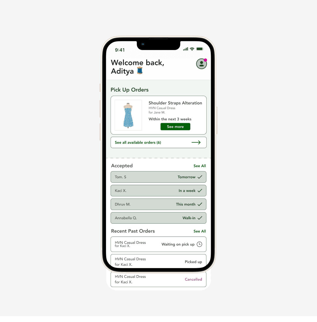
My design reduced Cimu's appointment scheduling time from 5 minutes to 20 seconds.
In other words, that's about a 90% reduction. Tailors can now easily book appointments and get all necessary information about the clothing piece ahead of time. Moreover, the app is neatly compartmentalized to avoid unecessary complexity and clutter.
Conclusion
My design reduced Cimu's major pain points and helped the product level up! Here's what I learned.
This was my first contracted product design project, and it taught me a lot about designing and prototyping in a professional setting.
Navigating team disagreements.
Throughout this project, I ran into conflicts with developers and the other designers on my team. Considering the brevity of my contract, I learned how quickly and effectively to realign our team’s interests and work towards a common goal.
Staying organized!
At first, I had all my designs thrown across a horribly messy Figma file. After I realized how difficult it was for others to go through to find my Password final final FINAL mockup, I worked on organizing my work into clear sections with explicit names. Honestly, this practice helped me as much as it helped the rest of the team.
Design based on research.
Sometimes, flashy UI can accidentally mask poor functionality. I learned the importance of designing with research-based objectives in mind, not simply just aesthetic-based ones.
It took multiple design iterations, meetings, interviews to bring this exciting project to life. Over the course of my contract, I created hundreds of prototypes in both low and high fidelity. If you want to know more about my process and thinking, please feel free to reach out to me!
Thanks for reading! And thank you to everyone who helped with this effort: Alana, Kaci, and Zepto. :)