I led everything design-related for Currents. Beta peaked at #149 on the App Store.♥
I was responsible for leading the design and product thought for Currents, a community-based social media app where content expires after 48 hours. More information available upon request.
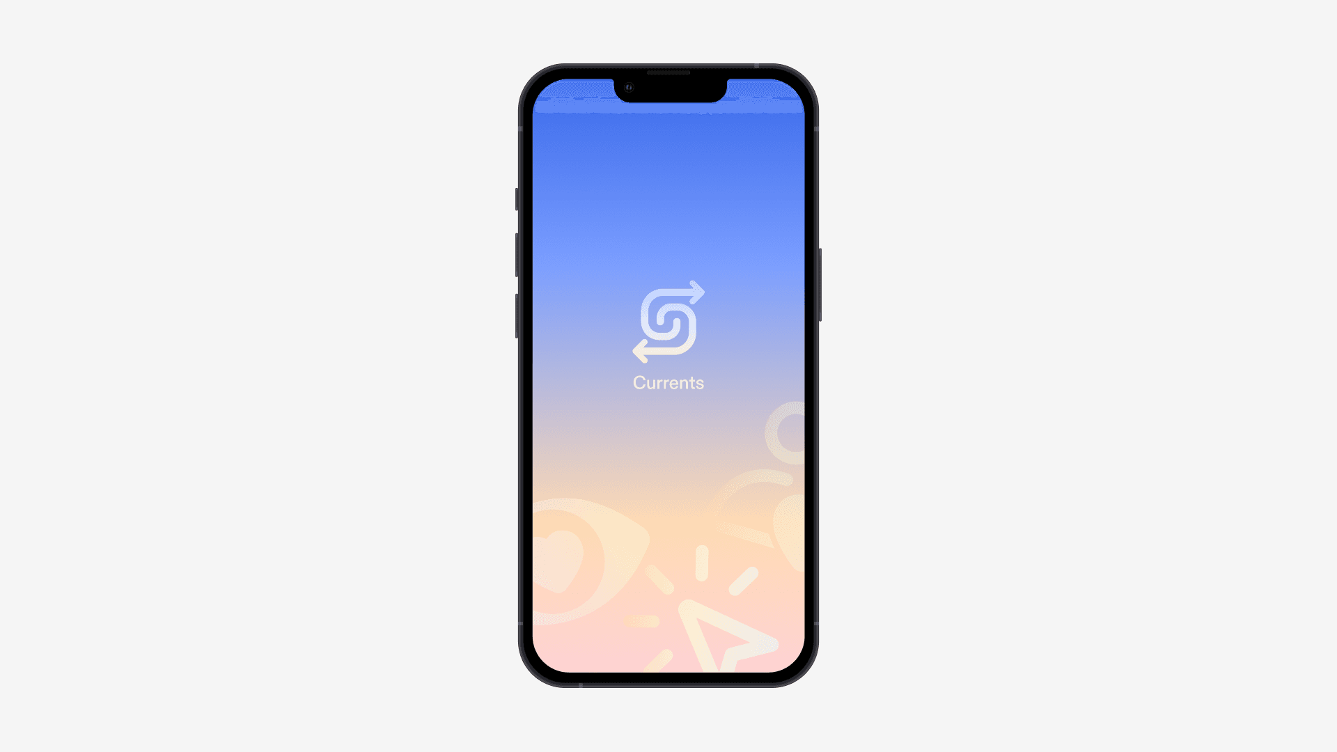
Currents
Social media that's actually social.
Disciplines
- Product Design
- Design System
- Identity
- Mobile
With
- Joanna Ni
- Sol Kim
- Subham Mitra
- +10 more
Timeline
3 months, Jun–Aug 2025
Overview
What if social media actually became social again?
Leading social media platforms like Twitter, Instagram, and Facebook are no longer about being social. Almost all content displayed on these apps are not shared by friends, but instead by professional influencers. What if there was a social media product that wasn't only about the doomscroll?
At Biography, I transformed this vague idea into a real, tangible app. I was responsible for not only leading the two-person design team for this project, but also for driving product strategy, deciding the feature set, aligning the team, and—most importantly—perfecting every single pixel of the interface.
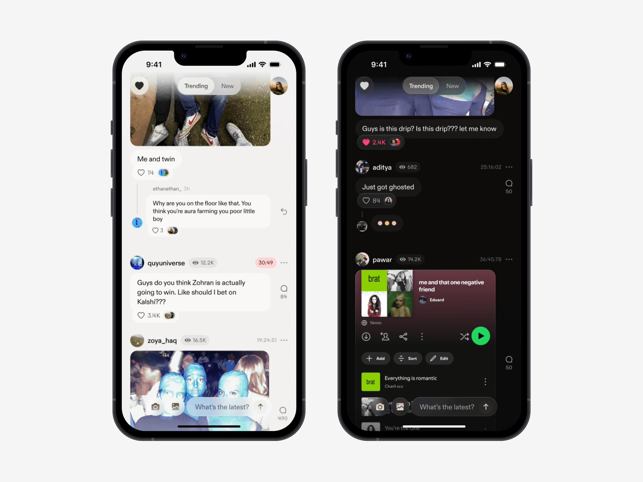
Feed
Candid, multimedia content from your community and close friends. All posts expire after 48 hours.
A key to Currents' identity was defaulting all posts to expire after two days. This not only addresses rising user concerns about digital privacy, but also made posting feel more casual and conversational. Our content structure can accommodate content ranging from text to images, videos, and polls.
Simple, intuitive previews for image and video content.
Images and videos in posts are sometimes cropped to ensure proper formatting (i.e. if they are too wide or narrow). To allow users to still view the proper images, we added a media modal. In the modal, users are still able to comment, like, and view post information.
Modal
Our media modal allows users to view posts when swiping up or tapping the up chevron in the bottom right corner.
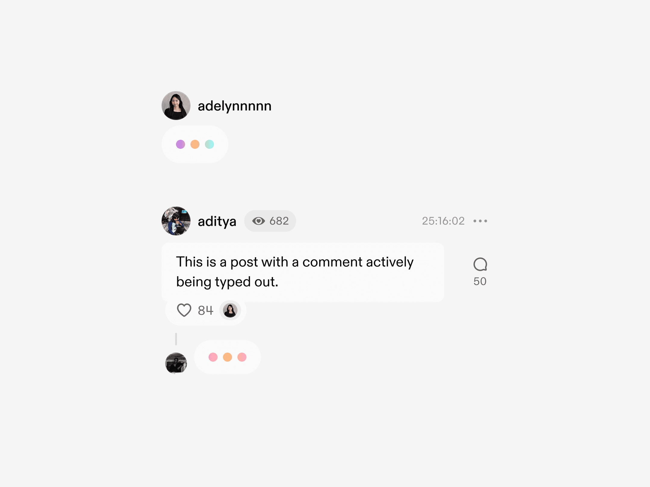
A commenting structure that balances one-liners with natural conversations.
Comments replying directly to the post are ordered by relevance, so that high-engagement replies naturally rise to the top. However, these comments mark the start of a proper conversational thread, promoting discourse and real convos!
Comments
Tap a comment thread to view the full conversation.
The key aha moment: live posting.
This feature was the missing puzzle piece to making the users truly feel like they were engaging with a room full of people. It became the first "aha" moment of our platform, since it could be passively shown to users as soon as they onboarded, without them needing to put in any activation energy of their own.
Live Posting
Users can see when others comment and post in live time.
Posting
Post on Currents faster than anywhere else.
Posting is the most important feature of our app, and it needed to be delightful, efficient, and simple. Unlike other social media apps, post creation on Currents happens within the feed itself (instead of in a separate sheet or subpage), reducing tons of friction. To add an extra layer of delight, I created a suite of colorful gradients that would appear behind the text box.
Create
Create posts quickly and casually, with a user flow that follows common user patterns.
Image Editor
A simple image editor tool for users to beautify and meme-ify their images.
Micro-interactions
Engagement
Double-tap to like a post.
Navigation
Glass components appear and disappear with a slight layer blur effect.
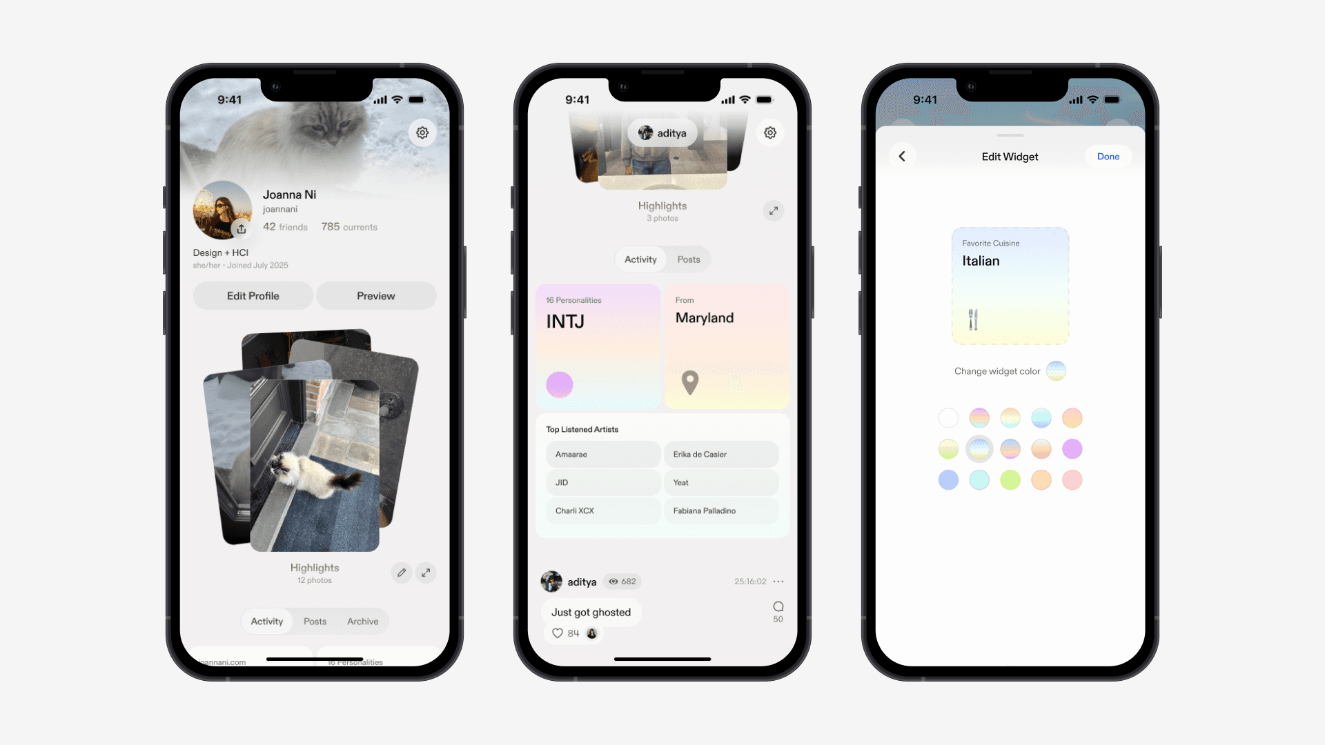
Profile
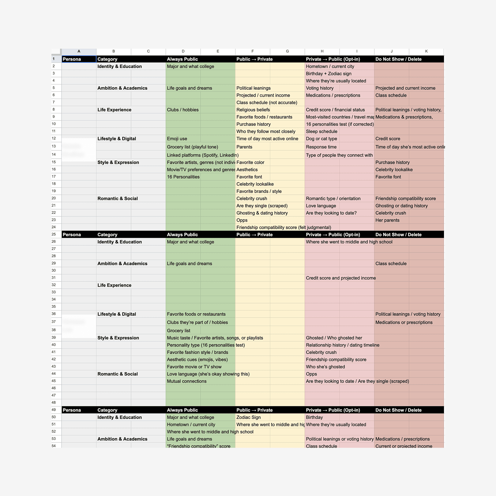
Customize your profile with personalized content, driven by 40 user interviews.
Our interviews revealed what our audience was comfortable with sharing about themselves and what info they were curious to learn about others. We turned these findings into editable "widgets" on users' profile pages.
System
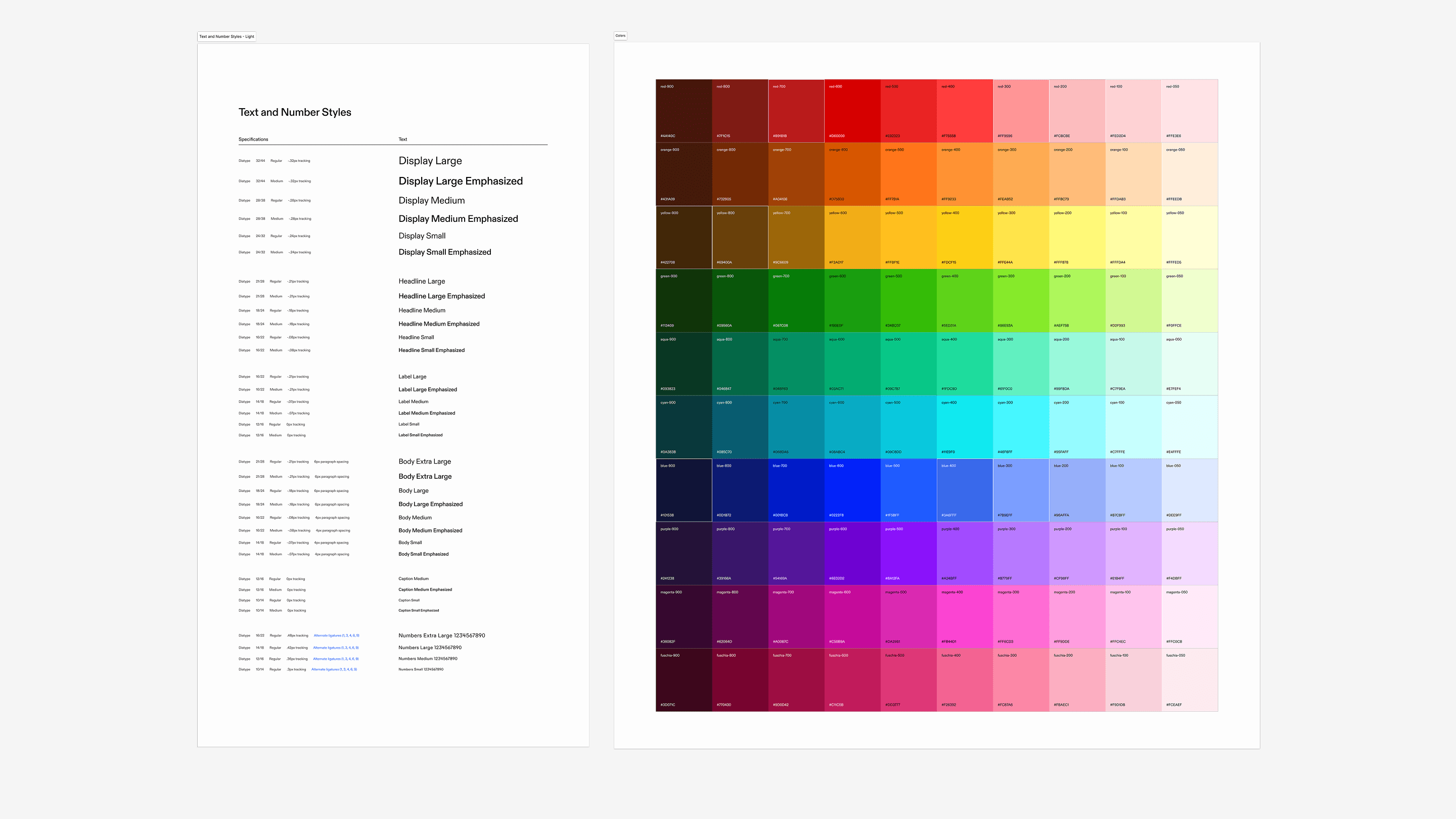
An app that works in both light and dark mode, powered by a design library that cut frontend lift nearly in half.
The library allows for both light and dark mode and allowed for all pages in the app to be composed of structured components, rather than hardcoded by hand. Along the way, I learned SwiftUI to help set the library up in Xcode, created rigorous typography and color systems, and set up robust and detailed documentation to ensure proper handoff. The library ended up having over 3,000+ variants!
Icons
Joanna and I drew over 200 icons from scratch for our design library.
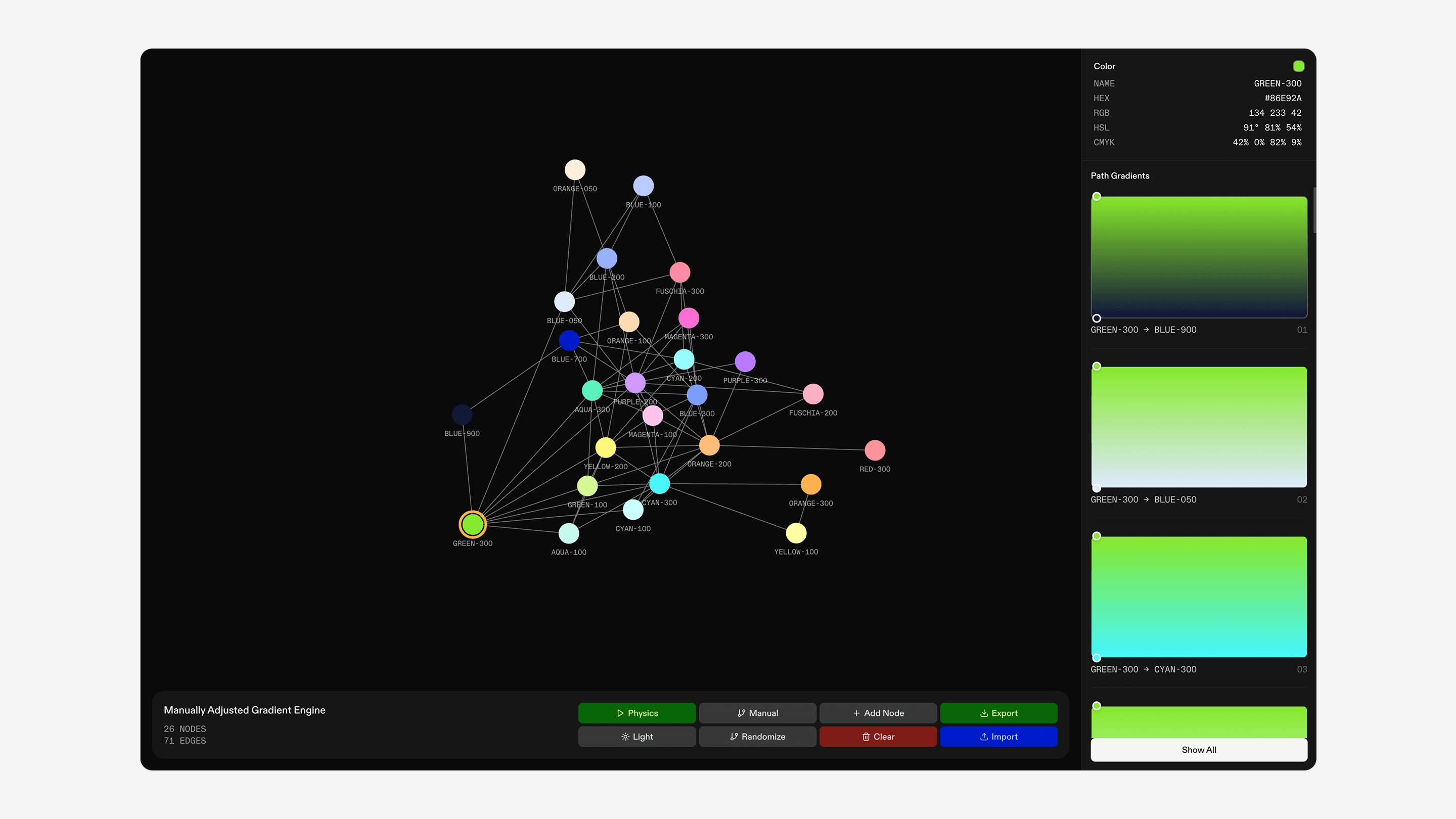
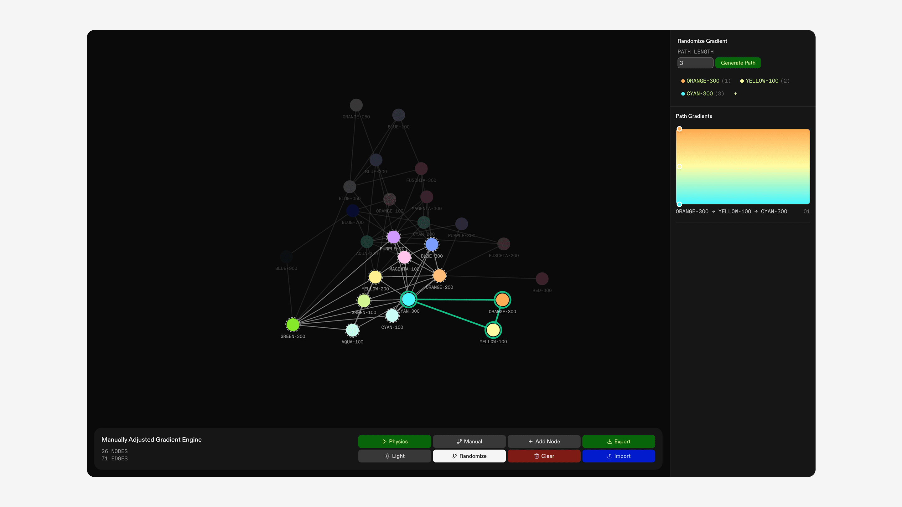
Gradients
I built an internal tool to generate random, beautiful gradients from our color library.
The tool, called the "MAGE" (Manually Adjusted Graph Engine) revolves around mathematical graphs. If each color in our library was a vertex on the graph, then we could set edges between the colors for any pairing that created a nice gradient. With this graph, we could randomly generate a harmonious n-color gradient by simply picking a random n-length path on the graph.
The concept is a little complex, but the tool is quite easy to use. Add colors to the graph, set edges between color pairs you like, and let the code do the rest!
1/2
Colors became vertices on the graph, with edges representing color pairings that created harmonious gradients.
2/2
This means that gradients can be represented as paths along the graph, allowing us to randomly generate gradients for our interface!
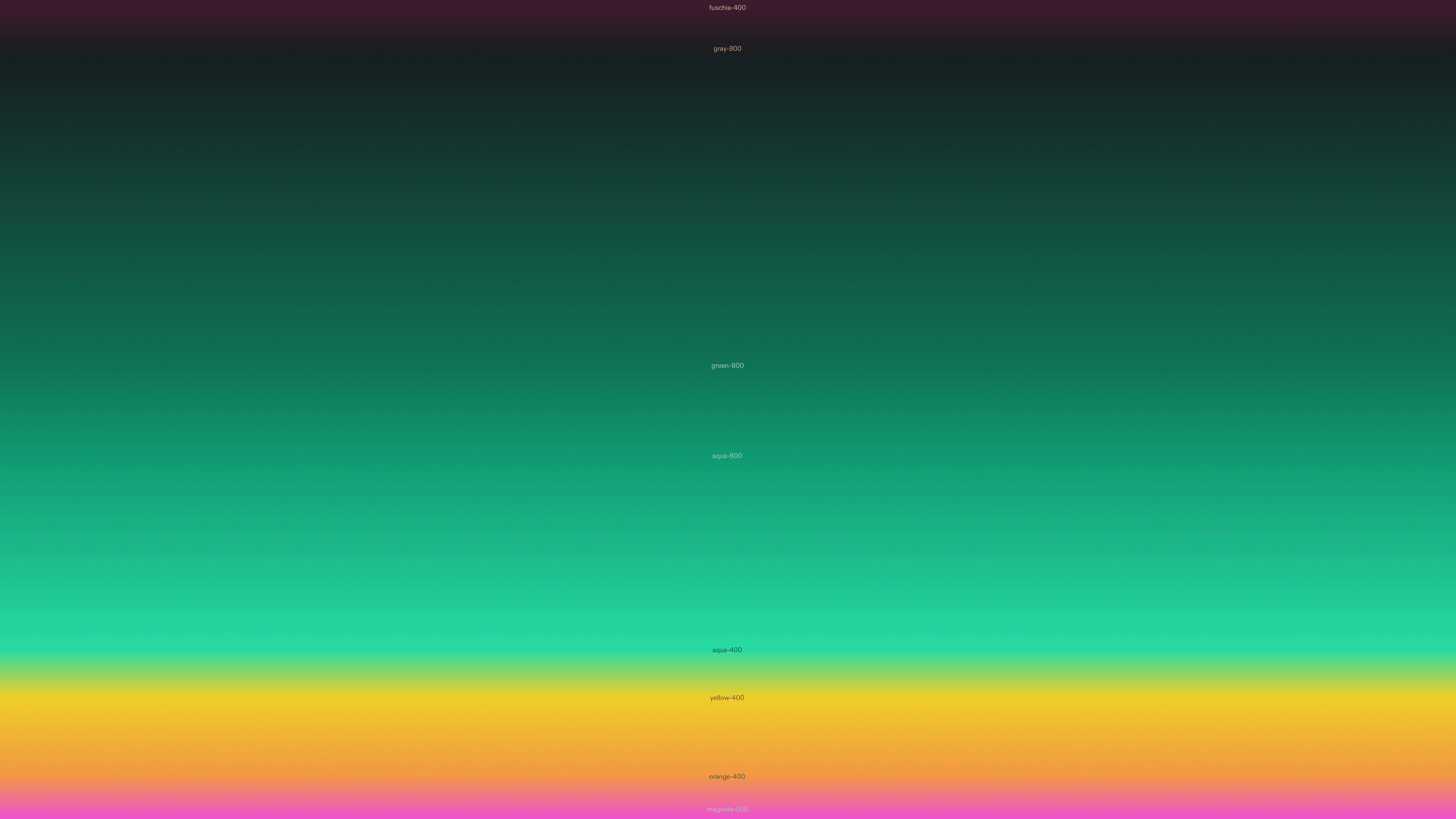
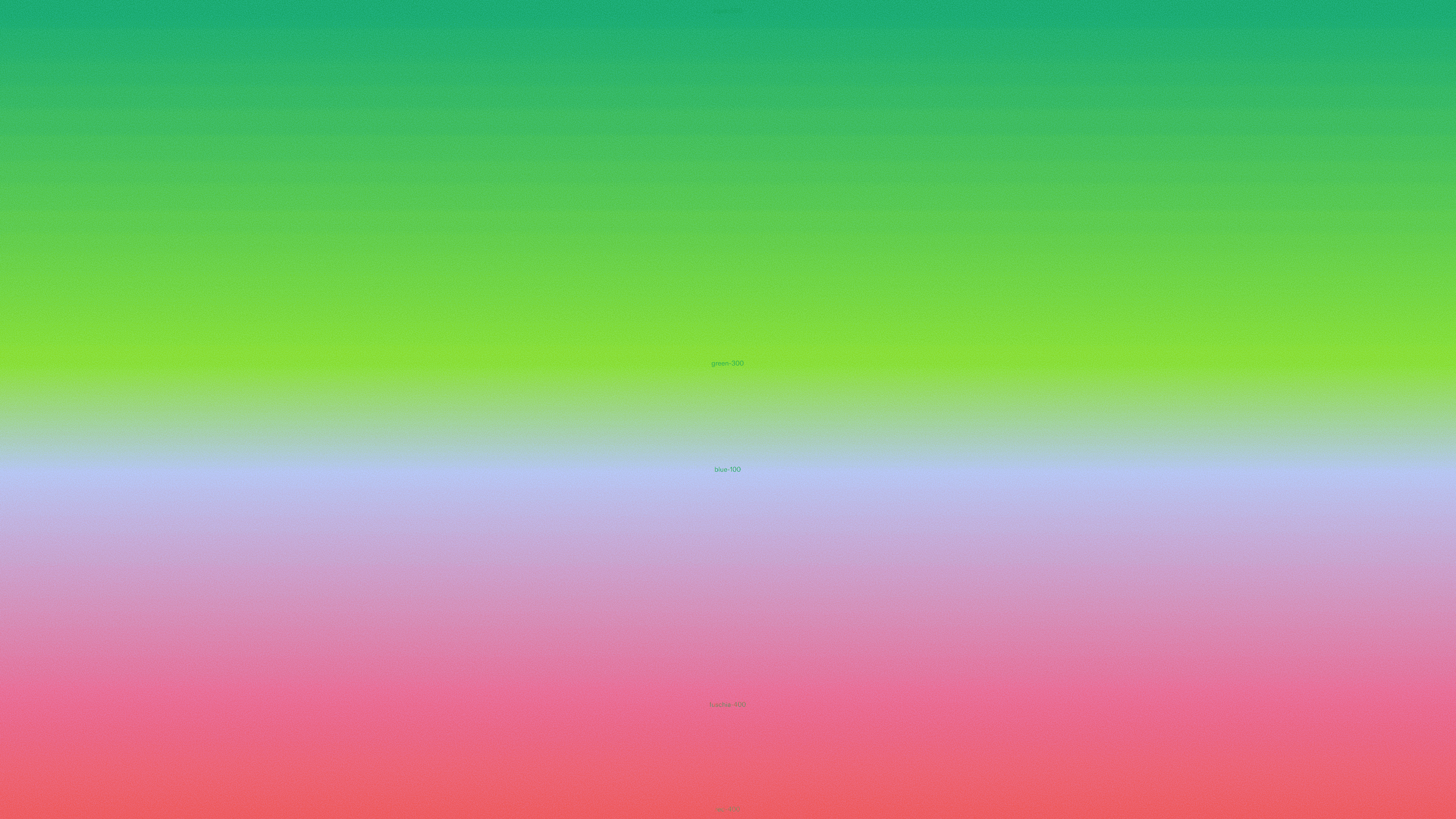
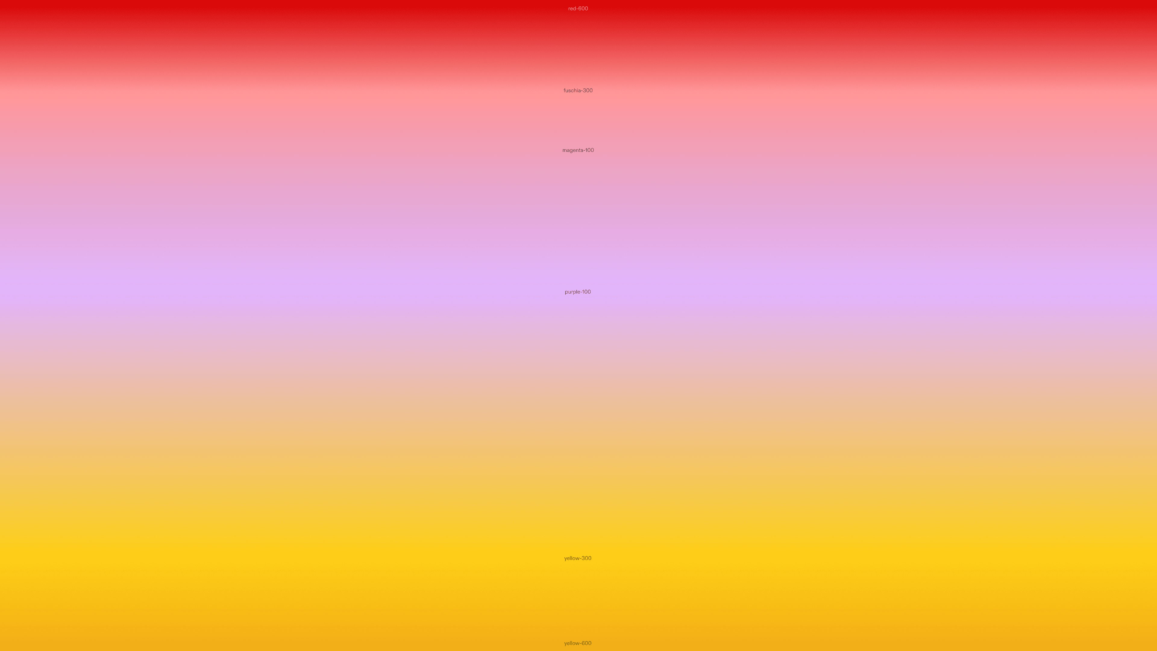
With this tool, we were able to display randomly generated gradients throughout our interface, bringing a new sense of delight every single time a user took a repeated action. We also used the tool to manually generate some more elaborate gradients that we used for growth materials.
/
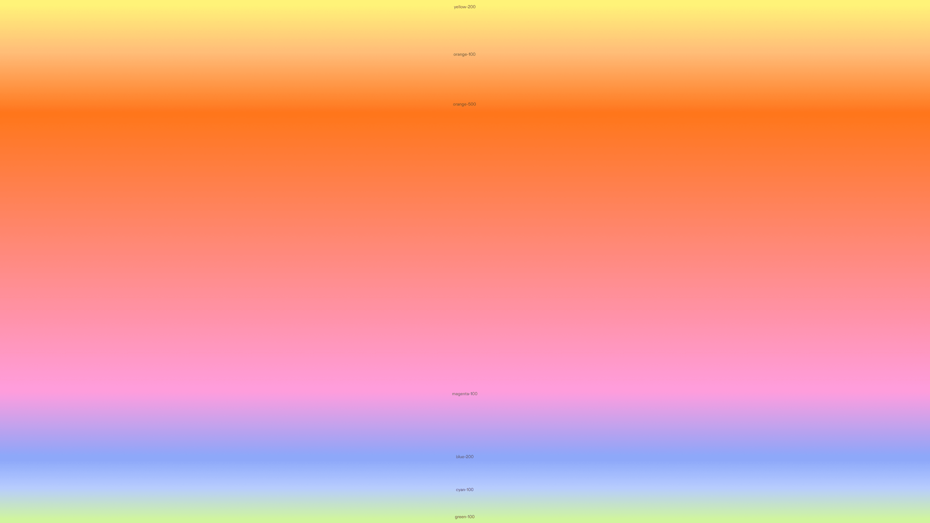
Sunset gradient.
1 of 5

Wrapping Up
After ten long weeks, we launched our beta, climbed the App Store charts, and raised at a $30M dollar seed valuation.
I joined Biography at the beginning of the summer, and everything since still feels like a fever dream. I cannot put into words how much I've grown from working with the incredible and brilliant Biography team. I grew much more confident in myself and my work, and learned how to stand up for my ideas without being stubborn or unreceptive to feedback. I also learned how to best set up prototypes for developers to implement and communicate in a fast-paced environment with a ton of people all working on different projects. It was a lot of trial and error, a lot of late nights, and a lot of last-minute scrambles. But somehow, we made it to the other side!
What's next for this project?
We're currently working on gathering user feedback to improve our product. While I am unable to show any of the new iterations I've been working on until we properly ship these refinements, I'm excited for the next chapter!
A quick update: we recently pulled Currents back into closed beta as we gather user feedback and work on improving the product for a proper launch. This unfortunately means that we're no longer allowing new sign-ups to the app for a little bit. But stay tuned, it's about to get a whole lot better!