I spent four months working on a passion project: a complete and holistic redesign of my favorite app, Spotify.♫
A case study offering suggestions for how Spotify could reorganize misplaced elements, retune half-baked features, and improve visual consistency. I based my work off of qualitative data, user interviews, and Spotify’s public design research articles.
Disciplines
- Product Design
- Identity
- Mobile
- AI
With
- Individual project. Just me :)
Timeline
3 months, Jun–Aug 2023
Prelude
A quick note before jumping in.
I downloaded Spotify nearly a decade ago and fell in love with the product well before I ever knew what product design even was. Spotify's design team has been a major inspiration for me throughout my design journey. This is not supposed to be a takedown of the incredible work the Spotify team does, but rather as a few suggestions on how their app can be improved from a UX standpoint.
Overview
Spotify nailed its product design early on.
The app was sleek, elegant, and it deeply understood its users. While competitors from trillion-dollar companies struggled to nail their user experiences, Spotify was already extremely efficient, balancing accessibility with delight. It makes sense that it's never been unseated as the king of the audio streaming market.
Above
Spotify’s user interface in 2018.
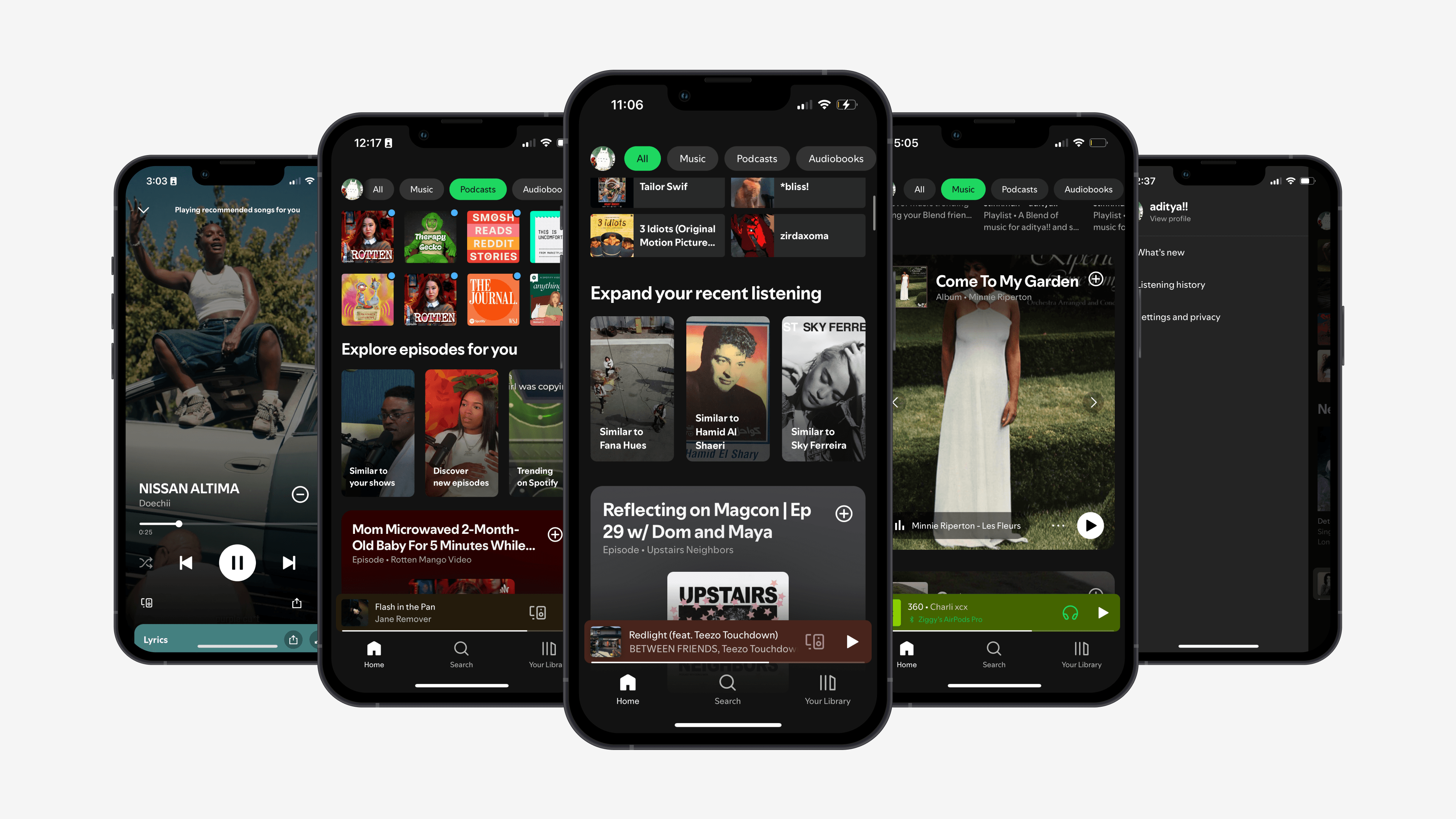
But in recent years, Spotify’s exemplary interface has become bloated, frustrating, and inefficient.
Spotify has introduced countless new updates to the app, many of which were great!
But I can’t help feel that the essence of what made Spotify so effortlessly streamlined in the first place is now gone. The app's now endless countless features are fighting for space and attention, instead of synergizing with one another.
Above
Spotify’s user interface as of July 2024, when I worked on this case study. So much is going on...
Research
Who uses Spotify? And in general, who uses audio streaming apps?
It would be remiss for me to blend 636 million users into a single user persona. Instead, I created the following graph to better understand broader listening habits that users have, regardless of other characteristics:
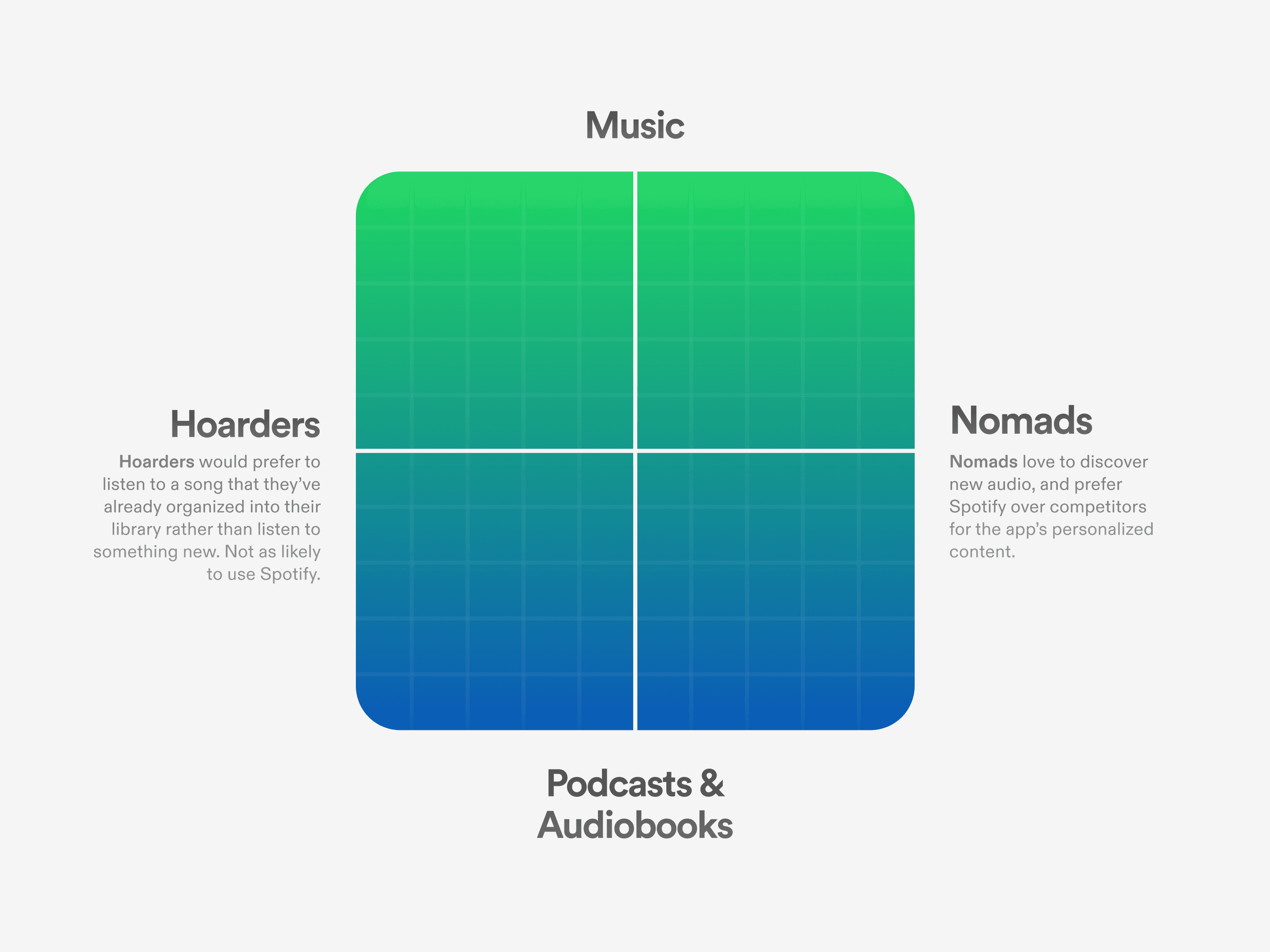
Above
There are obviously many important other factors to consider, but I believe the two most important for Spotify are how often a particular user engages with music discovery features and whether they listen to music, or podcasts/audiobooks. The hoarder/nomad idea was inspired by Jason Yuan’s case study "I Got Rejected By Apple Music... So I Redesigned It."
Spotify's core group are nomads and music listeners.
This is backed up by numerous user reports and Spotify's own design articles. However, most music-nomads I talked to said they would never give the app up, despite any frustrations they had with the interface. The cost of switching was too high, and Spotify's functionality was already satisfactory to them.
This was an important insight! It meant that Spotify's core group of users was already satisfied with the app, and I instead needed to prioritize making UX changes that would most improve the user experience for hoarders and non-music listeners (while hopefully making the core group happy as well).
Solve Spotify’s current issues in ways that best appeal to hoarders and non-music listeners, without compromising the user experience of Spotify's core group of music-nomads.
—My north star ☆
Problem
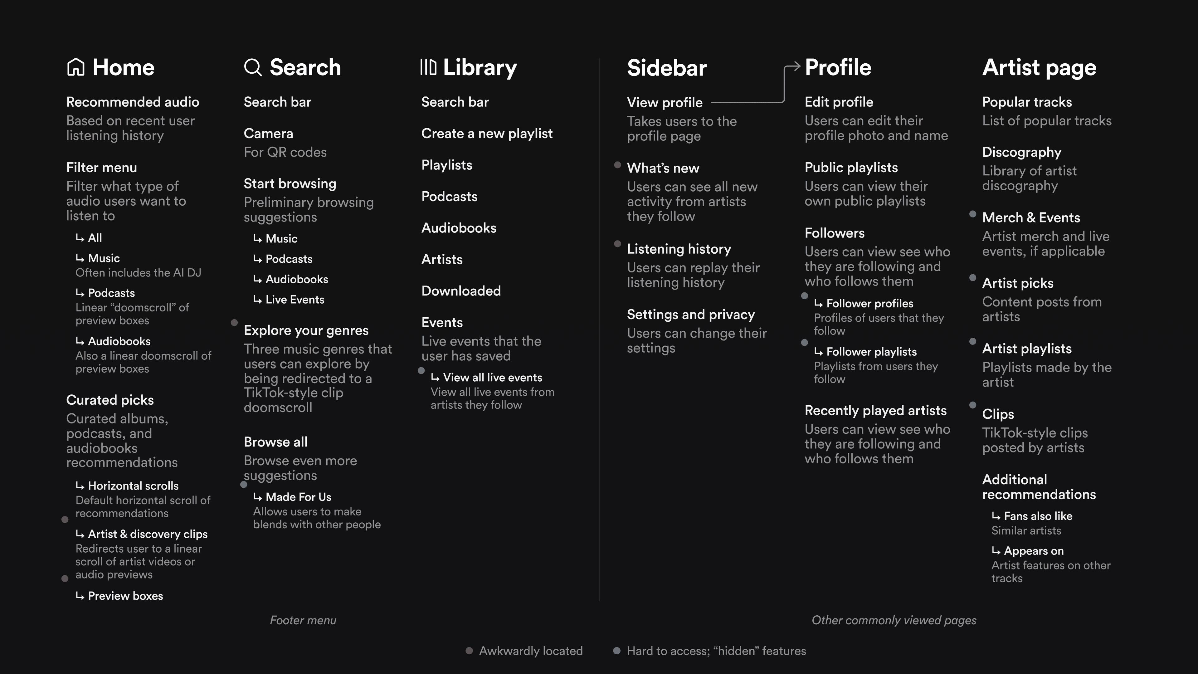
Above
A bird’s-eye view of Spotify. Elements that are awkwardly located are marked in red, and elements that are somewhat “hidden” are marked in blue.
What's up with Spotify's information architecture?
There are other contentions I have with Spotify's mobile app, but this was by far the most pressing. Not only is it the one that most affects its users, but it also hinders Spotify's ability to effectively add new features to the app.
“I swear Spotify keeps making it harder for me to just make a playlist and listen to music.”
—One particularly frustrated Spotify user I interviewed.
Spotify has added countless new features to the app. However, they intrude on core user patterns or are almost entirely hidden.
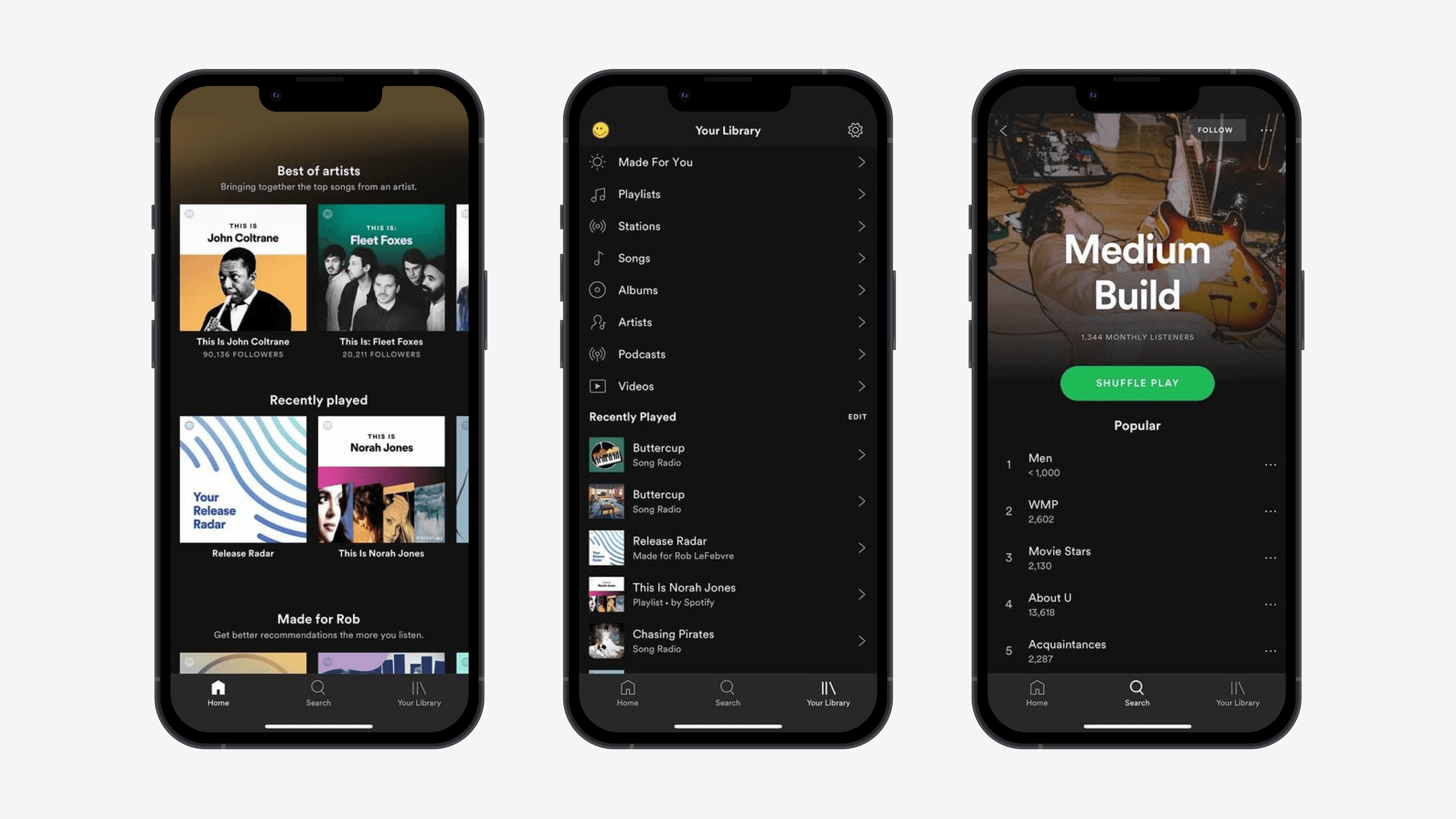
I doubt that when Spotify’s design team first created the iconic Home, Search, and Your Library footer, they anticipated that the app would grow the way it did.
Thus, the newer features Spotify has added don't have a clear home.
For example, Spotify's short-form music discovery channels are wedged into the app's Search page, while the live events page is hidden behind the subpage of another subpage. To tackle this problem I tried to find ways to better organize Spotify's entire interface.
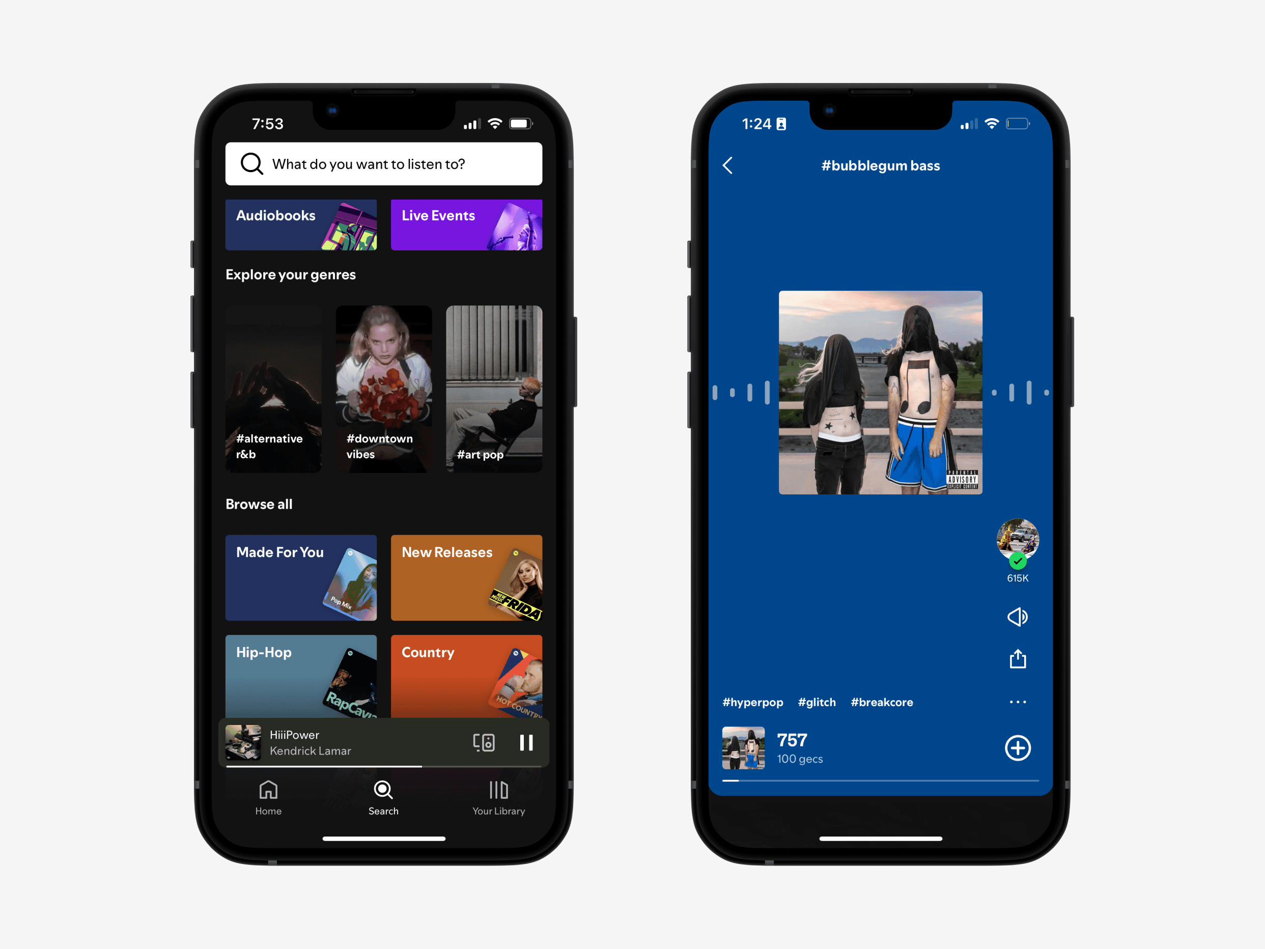
Above
Spotify’s TikTok-style music discovery channels are only easily accessible from the search page and only offer three randomized genres.
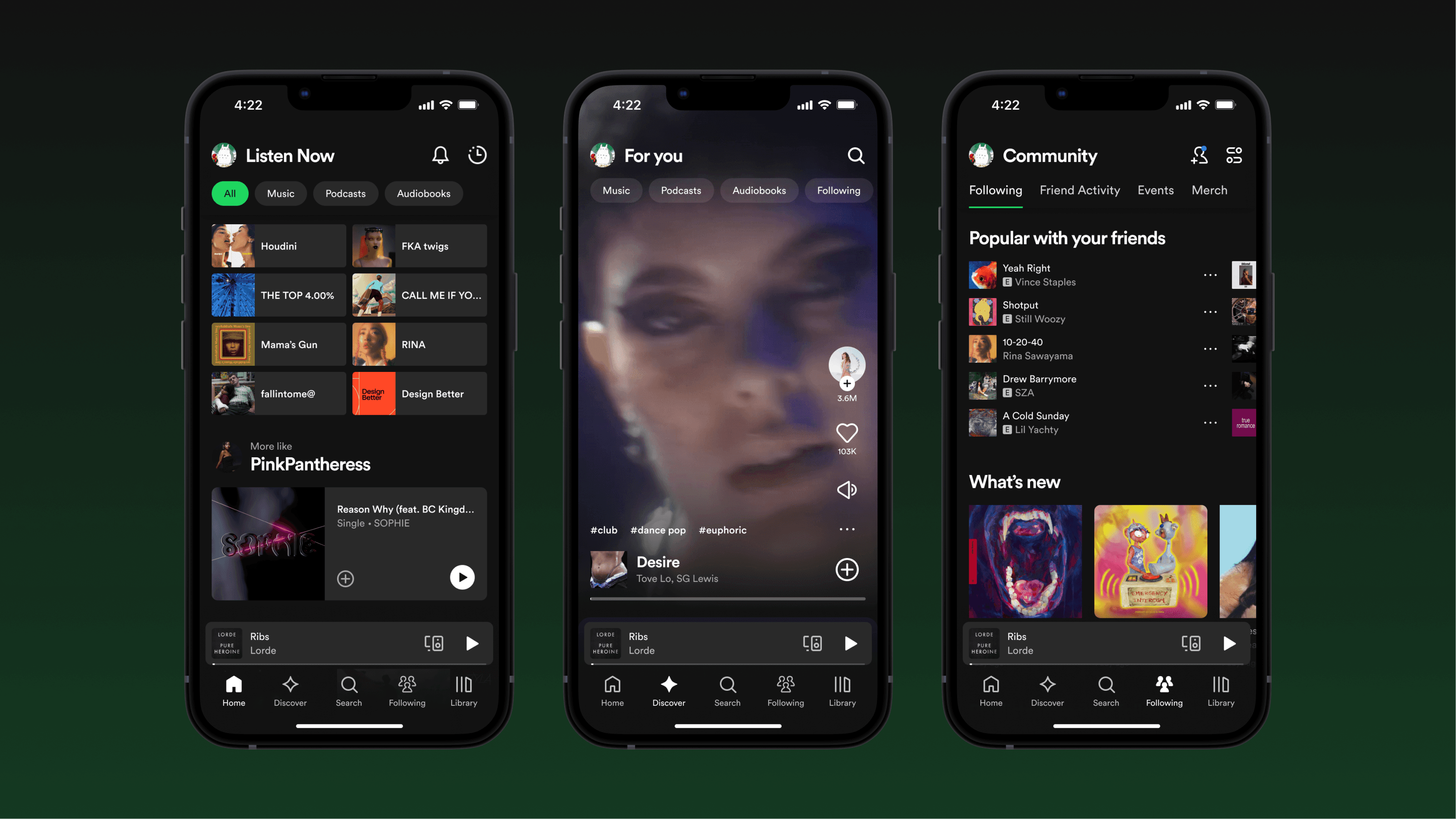
Discover & Following
Introducing two new pages: Discover and Following.
Both of these pages give Spotify more breathing room to house its misplaced features, while also supporting hoarders and podcast/audiobook listeners. To do this, they:
- Create low-effort ways for users to discover new music.
- Make it easier for users to discover podcasts and audiobooks.
- Are novel and interesting enough to entice users to switch from other streaming services to Spotify.
Above
Introducing the Discover page. This page gives hoarders a new reason to consider joining Spotify. Many users don’t want to commit hours to discovering new audio through curated playlists or podcast trailers, but would be willing to spend 30 seconds to check out a selection of curated previews.
Spotify has been experimenting with short-form music discovery features for a while. Discover gives them a dedicated home.
TikTok-style audio discovery channels were added in a recent update to Spotify. However, these channels are peppered across the app in a way that interrupts pre-existing user experiences. With Discover, an all-in-one page for short and sweet music exploration, this feature now fits snugly into the Spotify ecosystem.
This gives the concept space to reach its full potential. Many users may not be willing to commit 30 minutes listening to curated playlists or podcast trailers, but would be down to spend 30 seconds listening to a rapid-fire set of previews and trailers.
Above
Want to discover trip hop music? Maybe you’re really into true crime novels? Filter to your heart’s desire, or search a more specific query at the top.
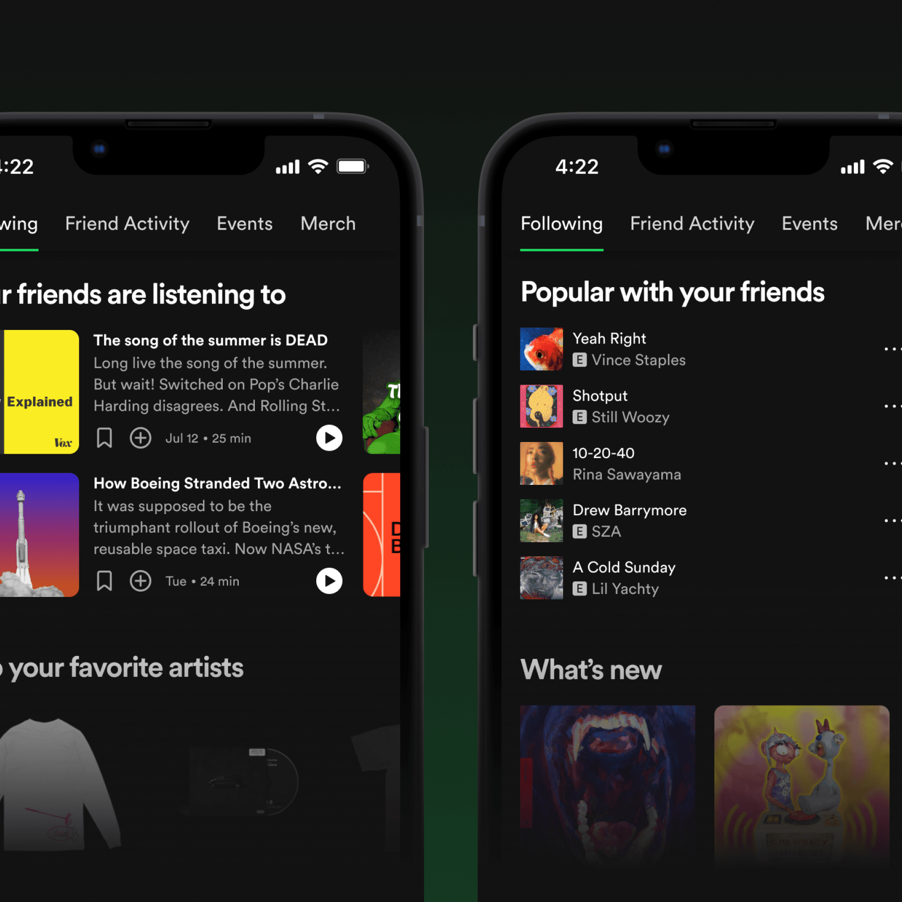
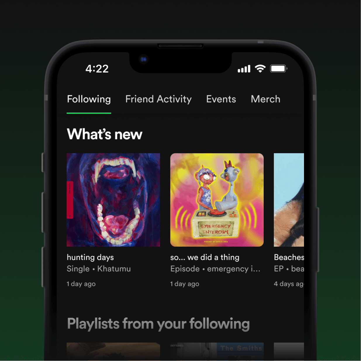
Above
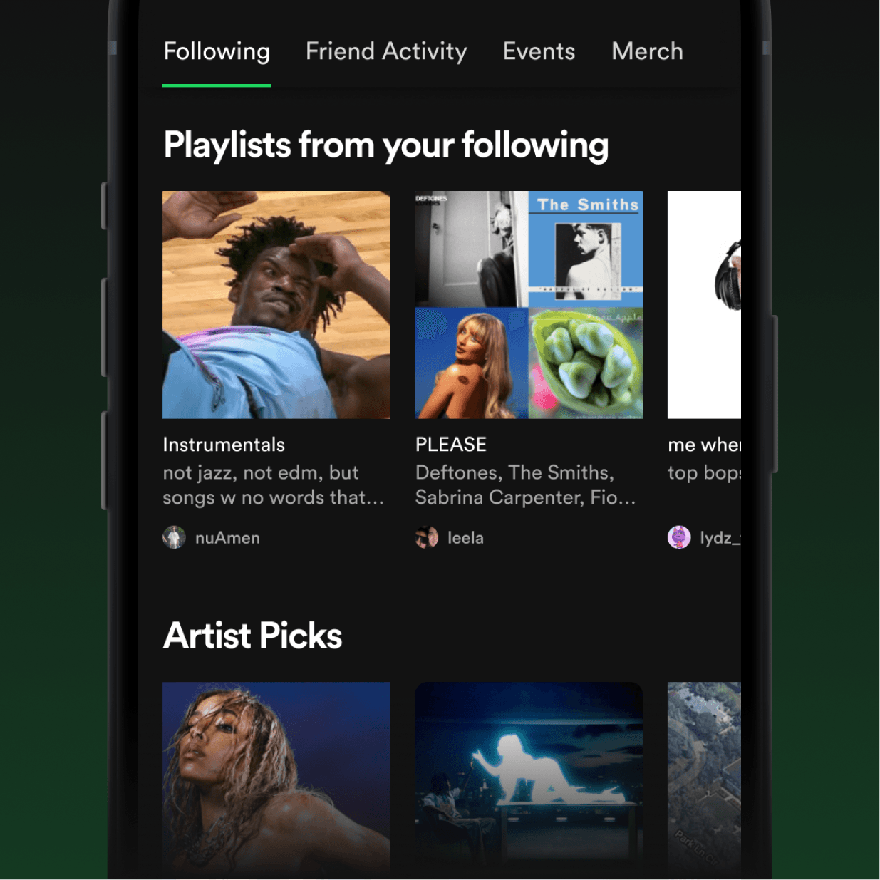
Introducing the Following page. While this page is inherently social, I was careful to ensure that all sharing features were entirely passive, preventing content starvation and maintaining Spotify’s audio-first identity.
Spotify continues to underestimate the power of network effects and peer pressure. Following unifies all of Spotify’s scattered but successful social features.
Nothing in life is certain except for three things: death, taxes, and the fact that people love to share their music taste with friends. We can see this from the massive success of Spotify’s social features such as Spotify Wrapped and Blend. And during my interviews, hoarders and nomads alike told me that they's be open to listening to new audio if it was vetted by their friends.
This page entices non-Spotify users to join the platform and gives users across the board a new way to discover audio.
It also makes it easier for users to stay up-to-date on all the latest from their favorite artists and creators (fantastic for hoarders). Spotify has almost double the users of its next largest competitor, so it should take advantage of that!
/
The main tab houses everything friend- and artist-related: music, podcasts, and books your friends are listening to, and all the latest from your favorite artists and podcasters!
1 of 7
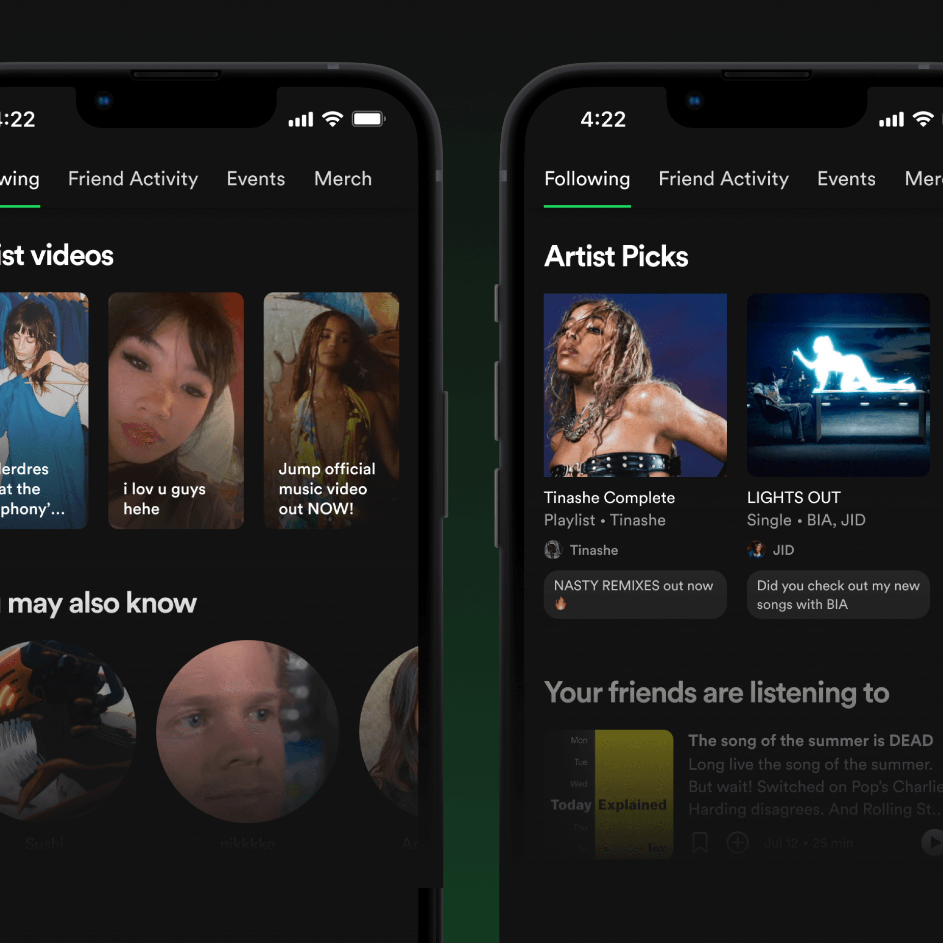
I completed the page by bringing a beloved Spotify desktop feature to mobile for the first time.
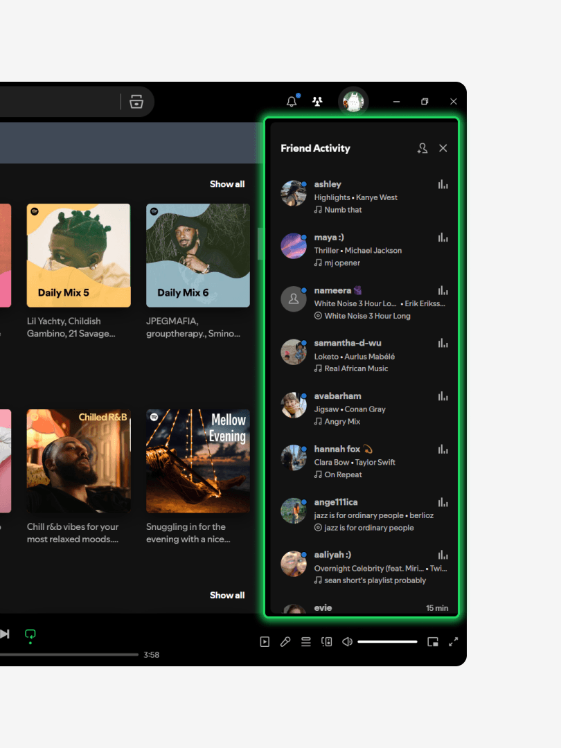
Spotify’s desktop app offers a tab called Friend Activity, which allows users to see what their friends are listening to in real time. Despite the high engagement this feature has (a popular app is entirely built around it), Spotify never adapted it for mobile. Here's what I imagine this feature could look like to fit perfectly into the theme of FOMO-driven social elements:
1/2
Spotify’s current Friend Activity feature on desktop.
2/2
My adaptation of Friend Activity for mobile. Users can tap any card to preview the audio their friends are currently listening to, with state-based scrolling to make navigation easier.
Feature Improvements
I then focused on improving Spotify's incomplete elements, starting with the DJ.
This is Spotify's hottest new feature. Like every tech company in the world, Spotify has been trying to capitalize on AI with a new feature: the DJ, which makes a mix for you "live." It's really cool!
However, the DJ doesn't currently allow for any user control, which is a major missed opportunity.
Without any option for customization, it means that users have no option to course-correct the DJ if it plays a mix that doesn't fit the vibe they want. Introducing: Ask the DJ.
Above
With this new addition, DJ X will never again play Mitski while you're at the gym. Unless you're into that.
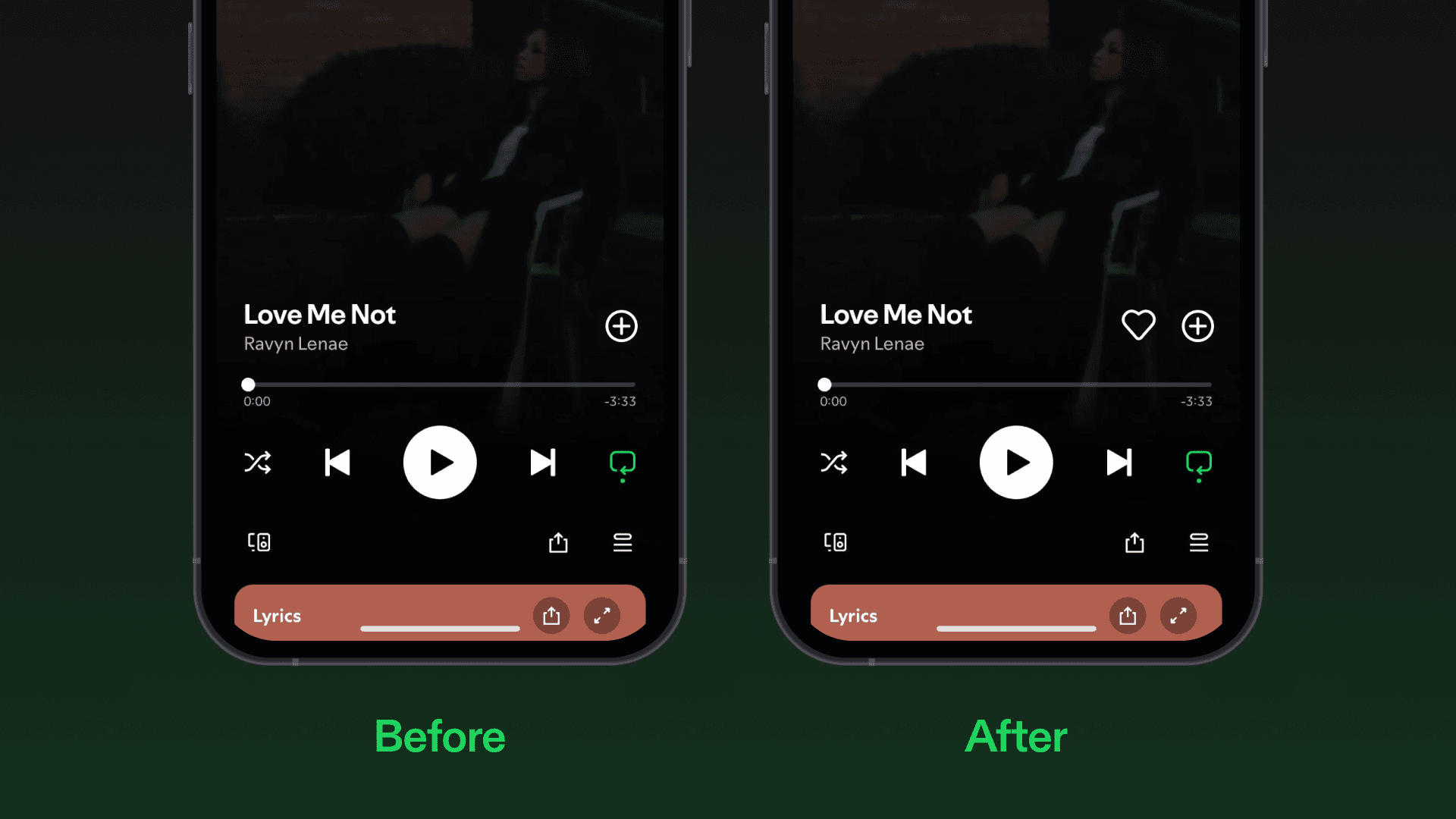
I also gave Spotify’s audio preview cards a much-needed facelift.
Preview cards were introduced two years ago, in an update that replaced the homepage with a TikTok-style doomscroll. It was so controversial that the update was repealed within days. Later, Spotify redesigned these boxes to be less invasive to the interface.
However, the preview cards are now confusing, lack clear visual communication, and don't follow standard UX practices.
Worst of all, there’s no delight in these cards, which sort of destroys the point of having them in the first place. I made a couple changes to make these cards more structured, intuitive and dynamic.
Before
Spotify’s current audio preview cards. User testing showed that the interactions of this are incredibly unintuitive. Not to mention, it awkwardly crops the album covers.
After
My redesign. It follows Spotify’s visual language as outlined in their design articles, and works with a wide range of content.
Finally, I tweaked one of Spotify’s most-used and most-confusing interactions: adding songs to playlists.
No button should ever do more than one distinct thing. Yet Spotify’s “add to library” button does two: it sometimes adds songs to a user’s “Liked Songs” playlist, while other times pulling up a menu for users to add tracks to playlists. It’s tedious, confusing, and annoying.
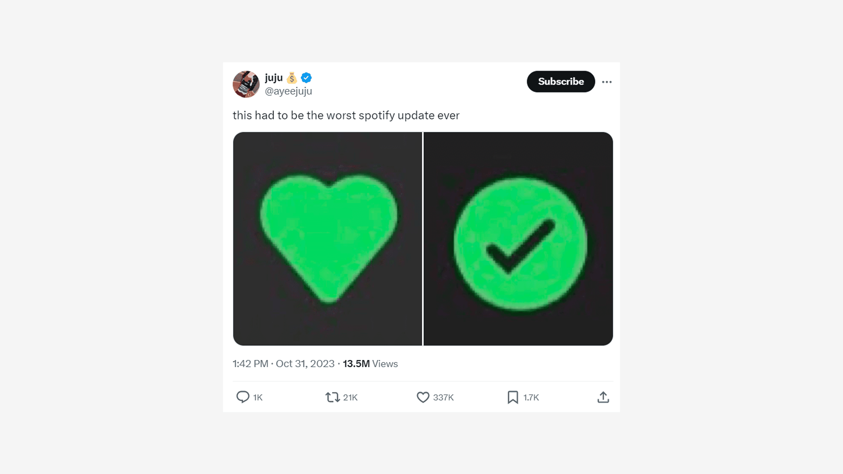
Above
If a tweet about something as un-viral as an app's user experience gets over 300K likes, something's probably wrong.
Hear me out. If this button is doing two separate things, why not just separate it into two different buttons? It isn't very invasive, doesn't overhaul anything major, but still makes a core user pattern much more intuitive.
Above
No more confusion: now there's a ♡ for adding to liked songs and a ⊕ button to add to playlists. This also reduces the number of taps needed to add and remove songs from playlists.
Final Touches
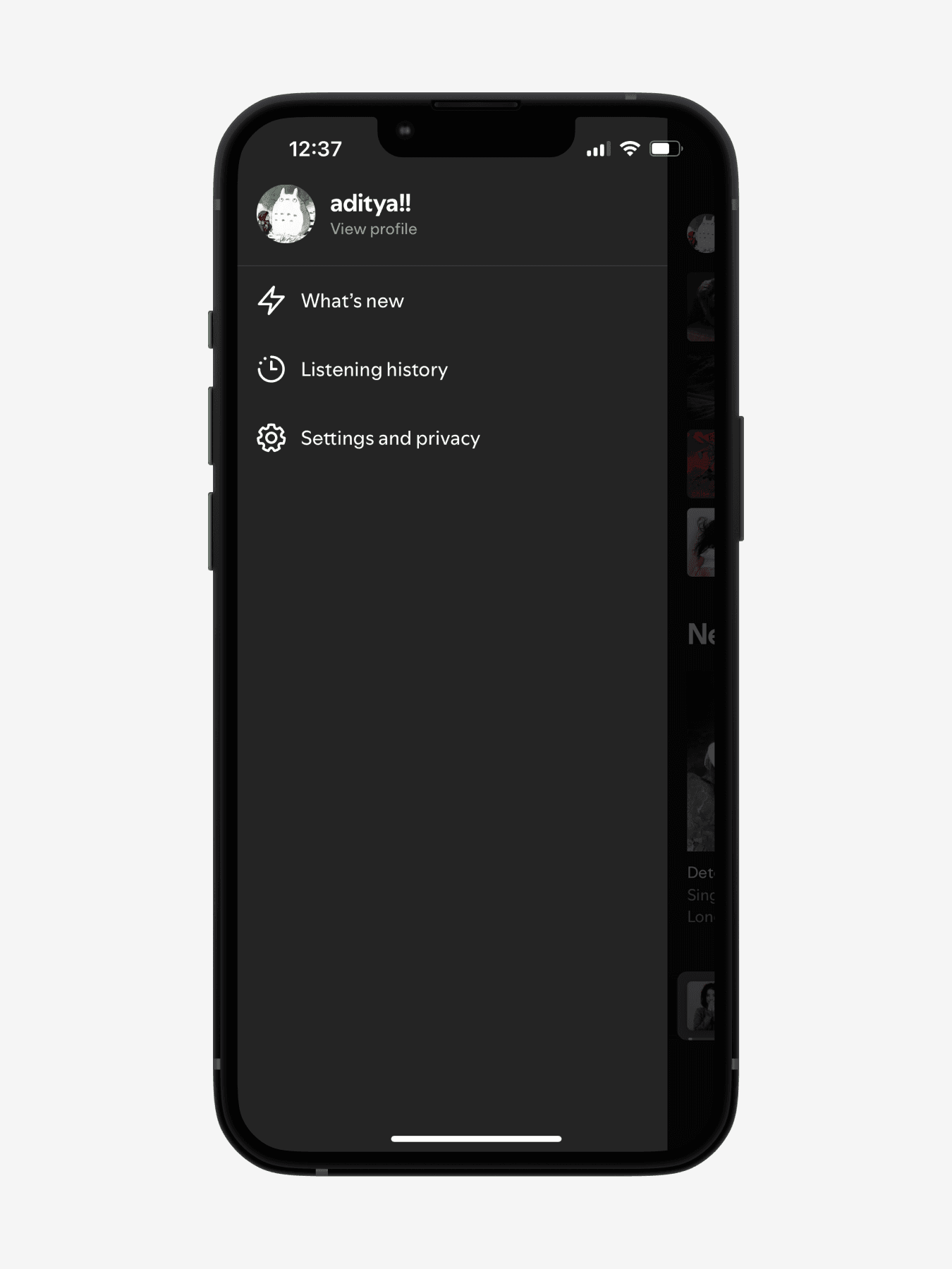
I restructured Spotify's side navigation menu.
Side navigation menus are typically meant for quick access of an app’s settings and key features. But the "key features" of Spotify’s menu seem to be only two things: listening history and notifications, which seem incredibly out of place.
Before
Spotify’s current side menu is almost completely empty and provides very little navigational utility to the app.
After
I redesigned the menu to include some elements that offer more navigational utility to users: quickplay options for Spotify’s evergreen playlists, pinned audio, and in-progress audiobooks and podcasts. Considering our north star, it seems useful to make resuming podcasts and audiobooks more easily accessible on Spotify.
I also made a couple tweaks to Spotify’s home page to improve its hierarchy.
Right now, the content on the home page is difficult to read at a glance. I spaced out the frequency of preview cards, added a second row to Recently Played, and made some minor typography tweaks to make the page easier to read and scroll through.
Before
Spotify’s current homepage, which is currently a jumble of autoplaying audio preview cards and horizontal carousels.
After
I added What’s New and Listening History back to the homepage (where they existed in previous iterations of Spotify), keeping them accessible but in a spot that feels more synergistic with the overall page. I also set Spotify’s auto-playing audio preview cards to appear every 3-4 elements, so they serve as a consistent visual break from the other elements on the page.
Conclusion
My redesign focused primarily on cleaning up Spotify’s jumbled app structure, while also retooling a couple unintuitive features here and there.
Let's quickly walk through some of the major changes I made to make Spotify's UX more unified, holistic, and intuitive:
/
Explore new music on the Discover page.
1 of 7
/
I always find that the best way to learn is through getting my hands dirty.
I’ve always admired Spotify’s design, and I can't stress how much I learned about design by diving deep into Spotify and trying to improve it. Simply having to practically recreate the entire Spotify interface—from scratch—on Figma and Principle taught me what it takes for a product to be refined down to the pixel, and helped me grow more familiar with the ins and outs of design and prototyping software! Not to mention, I gained a better understanding of how to conduct user interviews, identify pain points in an app, and maintain a consistent visual identity across an entire interface.
As an avid music-lover, this project is one that matters very deeply to me. There are tons of details in this project I omitted from this write-up for the sake of brevity. If you have any questions about anything you see or are simply curious, feel free to reach out to me!
A quick update: I originally wrote this case study back in 2024, and there have been many revisions to the Spotify interface that I originally wrote about. Keep in mind that my suggestions were specific to the version of Spotify I had on my phone. I have a ton of respect and admiration for the designers and creative directors over there; they never fail to inspire me and blow my mind. Thanks for reading!