Refining a platform for college students and health admin nationwide at Volta.☤
Volta is an integrated health compliance startup that helps universities manage student insurance, immunization, and engagement through automated tools and real-time insights. As a product design intern for half a year, I owned the full redesign of the admin dashboard and side navigation menu and worked on handful features for the mobile app.
Disciplines
- Product Design
- Web
- Mobile
- User Research
With
- Kelly Manlaiyabar
- Alana Liu
- Lubna Hameed
- Wesley Stuckmeyer
- & others
Timeline
7 months, Nov–May 2023
Overview
Health management systems have long been unintuitive and outdated. Volta is changing that.
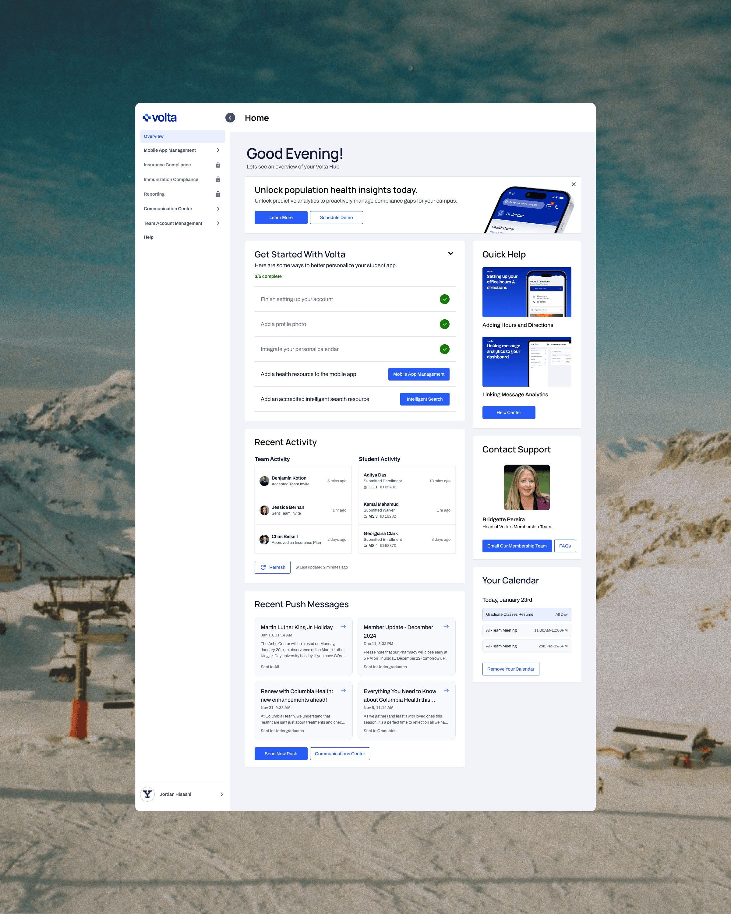
Volta is an all-in-one platform for university admin to manage student and employee health. Built by real doctors, and advised by former university health administrators, the product aims to target and resolve all of the major pain points in campus health. Clients of Volta include the Mayo Clinic, Emory University, and Ohio State!
Volta's platform comprises of a student-facing mobile app and an admin-facing desktop hub.
The student-facing app allows students to send necessary health information (i.e. immunization records) and navigate the school's various health resources. Meanwhile, the desktop website helps university health administrators compile, organize, and efficiently manage that data.
During my seven months on the team, I spearheaded a complete overhaul of the hub dashboard and side navigation menu, conducted a little bit of user research, and made some minor improvements to the mobile app.
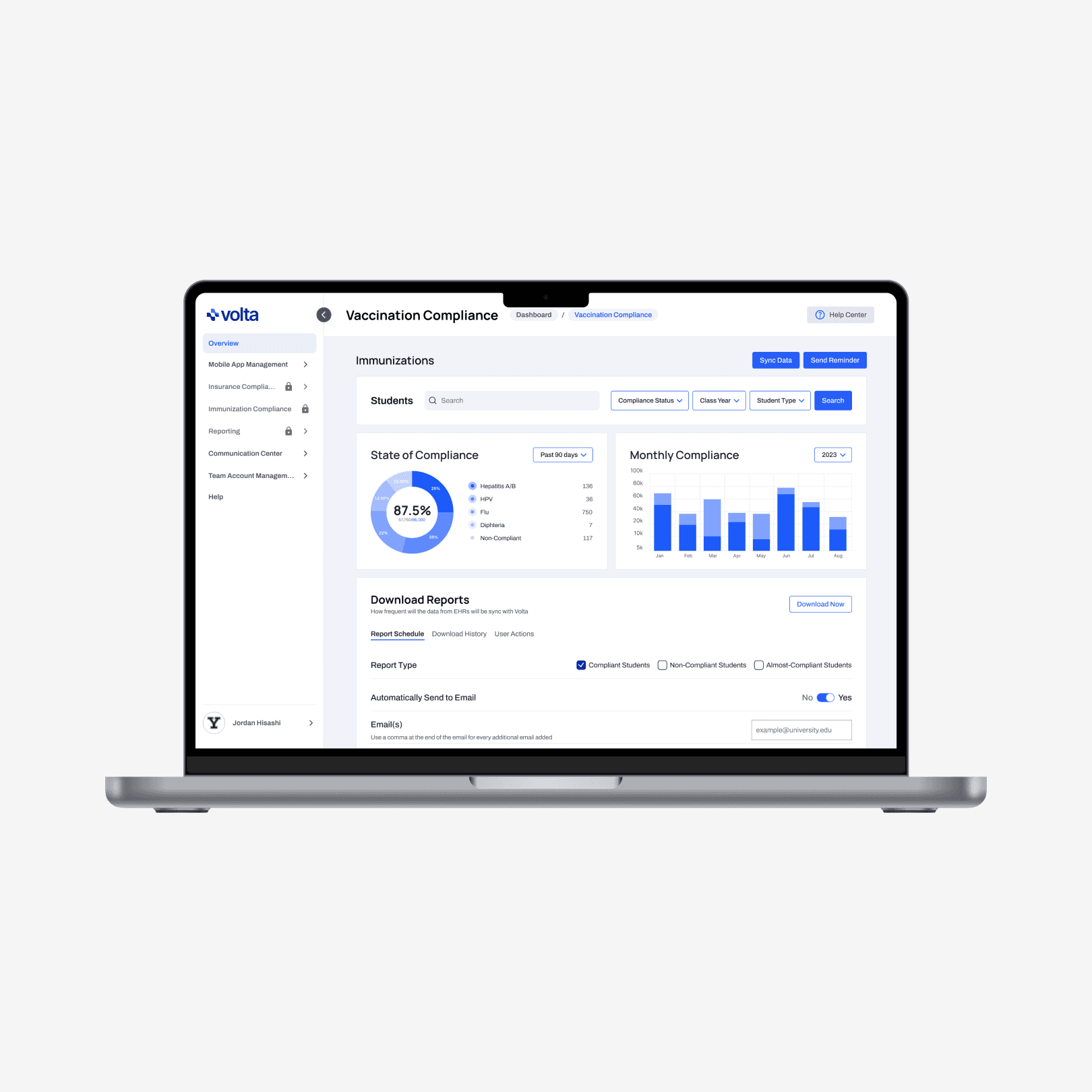
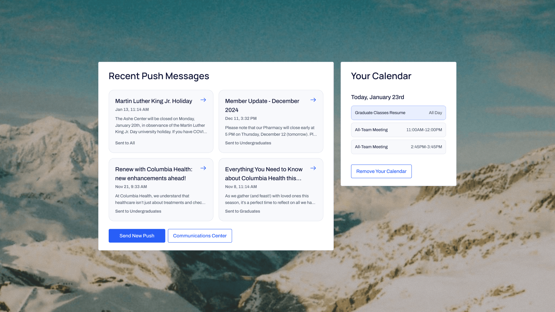
Above
Volta's desktop app, for admin to manage on-campus health data.
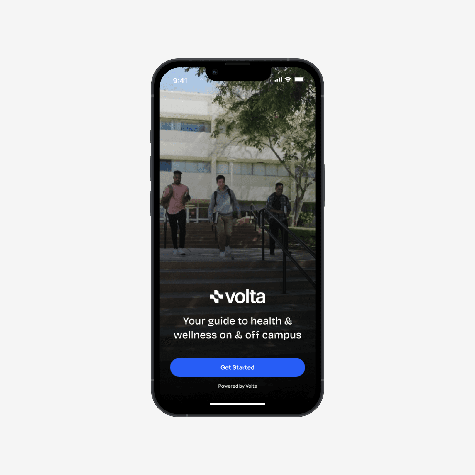
Above
Volta's mobile app for students to submit their health information and explore university health resources.
Dashboard
I owned a full redesign of Volta's admin dashboard.
When I joined Volta, I worked on creating an admin dashboard with a modular "widget"-style layout, which allowed where users could customize the content of their page to best suit their needs. This seemed like a solid idea at the time, but we quickly found that this idea was unintuitive and lacked cohesion.
Let's break down the key issues in-depth:
Above
Volta's preliminary admin dashboard design. This is the initial state of the modular dashboard.
"Sometimes clients will ask me questions about using the dashboard, and even I will get confused by the page when trying to help them."
—Bridgette Pereira, Head of Volta's Membership Team
The dashboard's "personalized" modular structure confused administrators more than it helped them.
Despite the layout allowing for extra personalization, the complex structure of the page confused more users than it helped. Administrators would often drag cards around by accident and get overwhelmed.
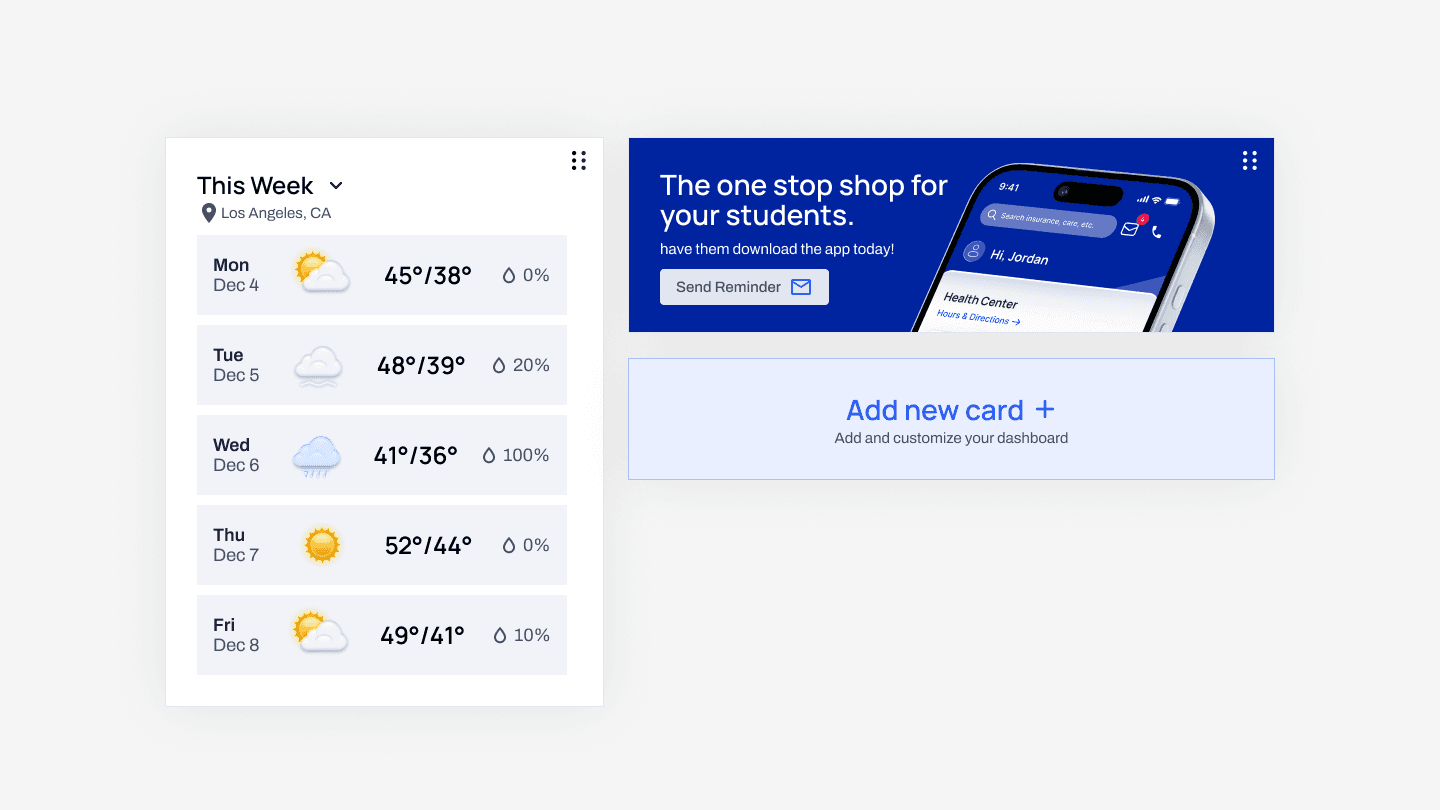
Above
Sidenote: why would an administrator need to know the weekly weather report on Volta?
The majority of individual components on the dashboard weren't useful for administrators.
The cards on the dashboard didn't help users navigate to other pages to view additional information. Plus, most of the data on the dashboard was either hidden behind a newly implemented paywall or simply didn't update often enough to be useful.
Most importantly, none of these cards helped onboard new users.
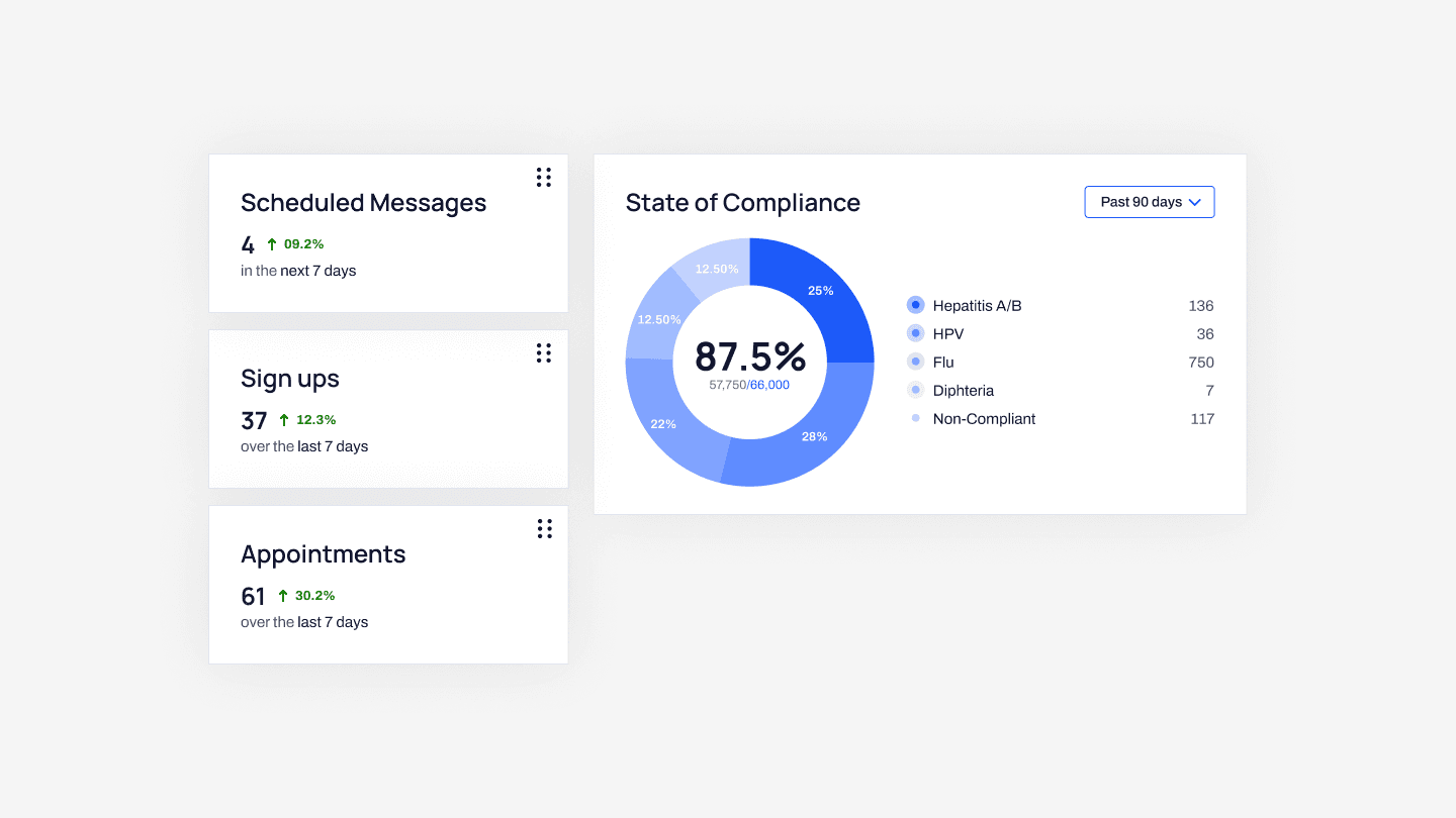
Above
Much of this data doesn't update often. For example, seeing the quantity of scheduled messages proved to be far less helpful than seeing the content of the messages themselves.
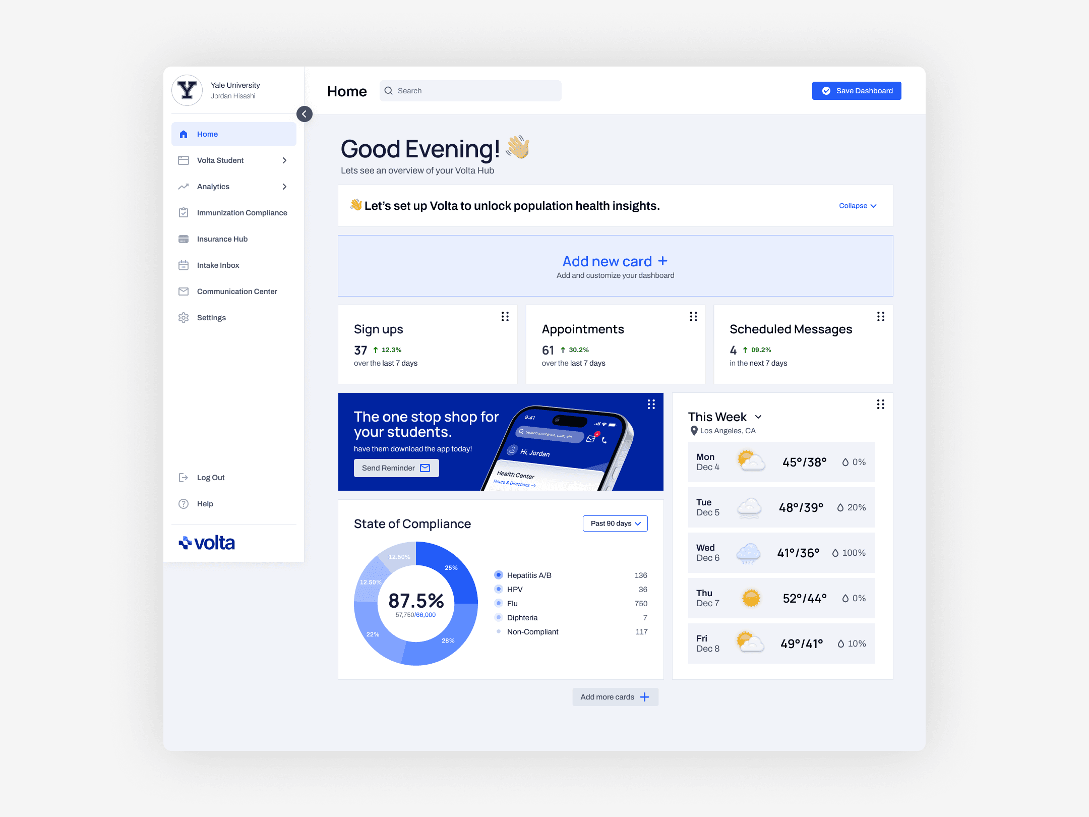
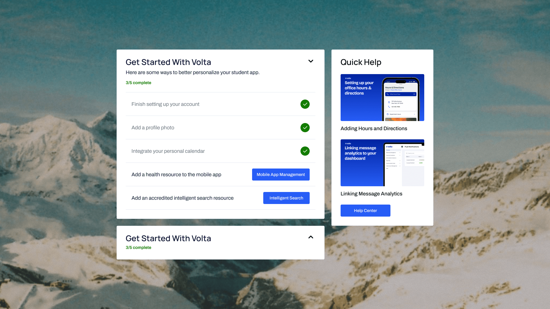
I owned a full redesign of the dashboard, contributing to an increase in revenue and positive user feedback.
I ditched the modular layout and crafted new components that provided more informational and navigational utility to the page and better helped new users familiarize themselves with the Volta platform. This redesign was shipped after close collaboration with my PM, Volta stakeholders, and developers:
Above
A new admin dashboard for Volta.
Prioritizing easy onboarding for new users.
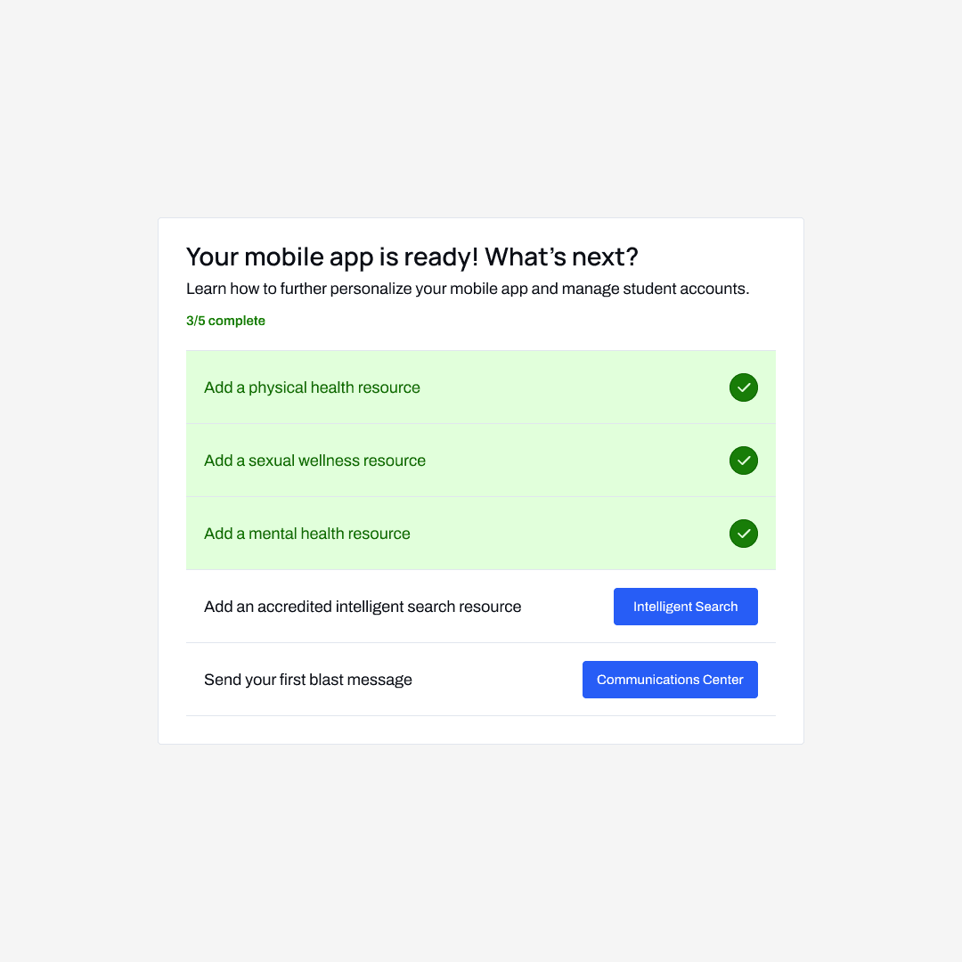
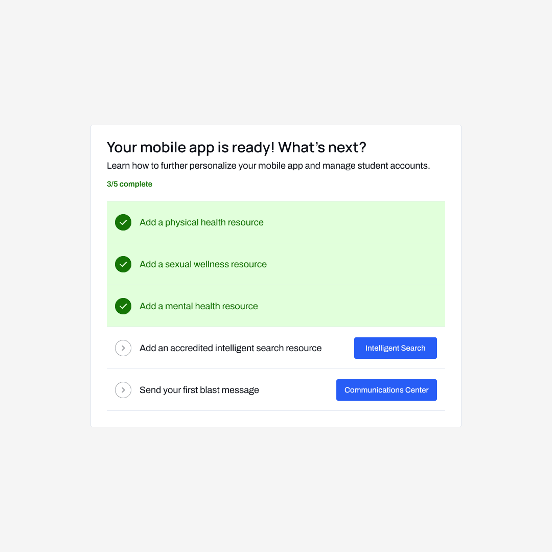
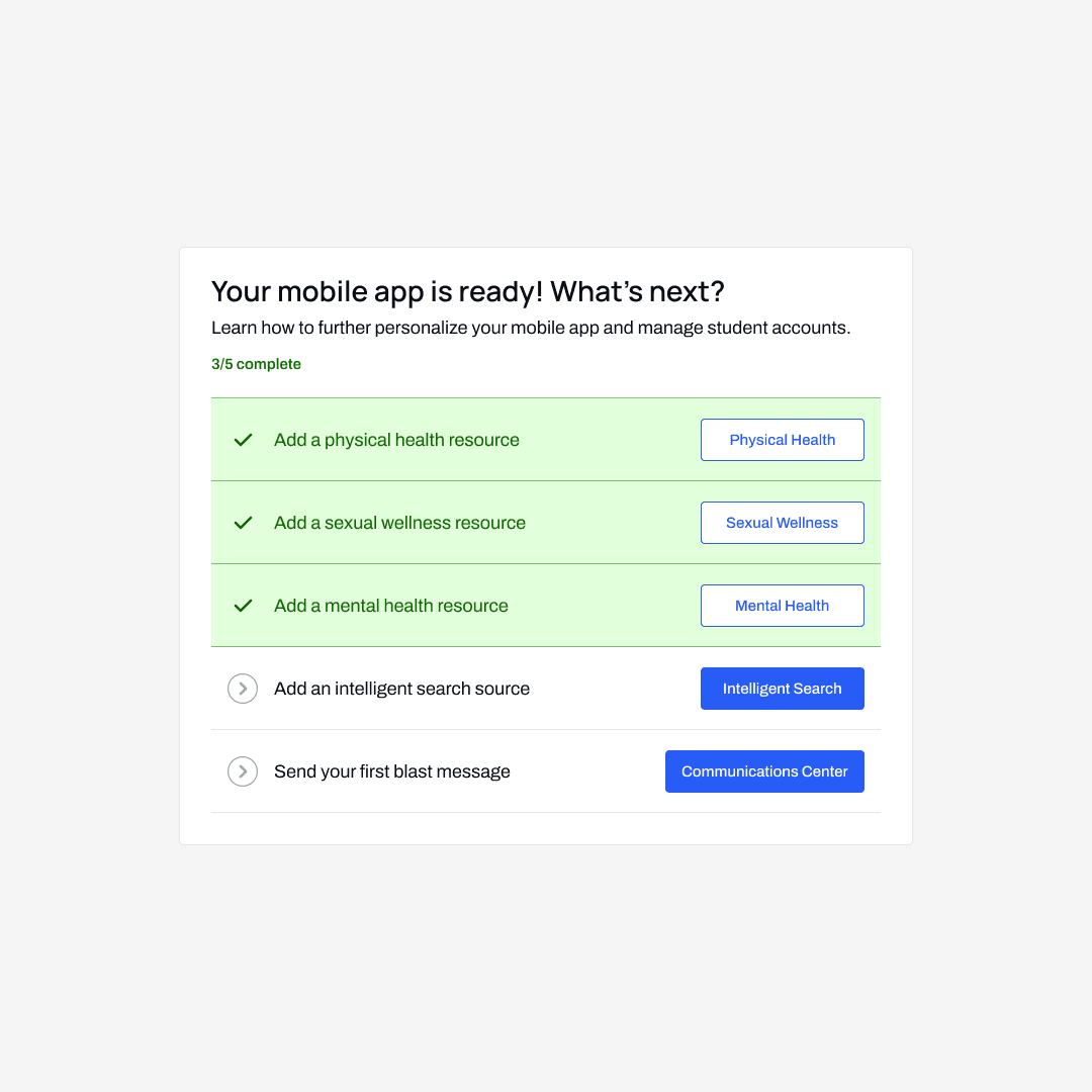
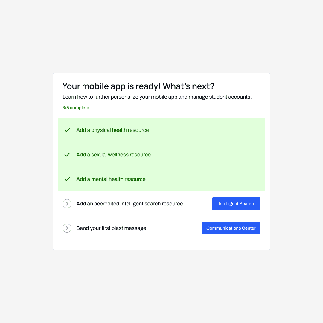
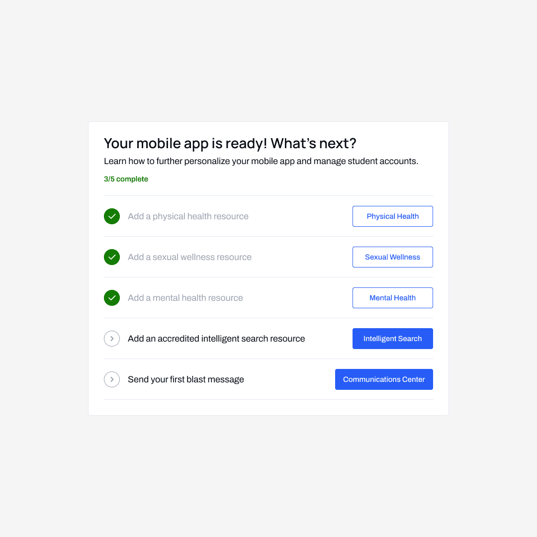
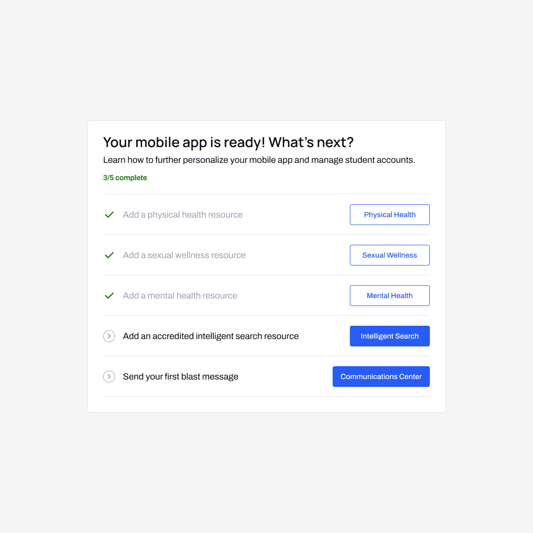
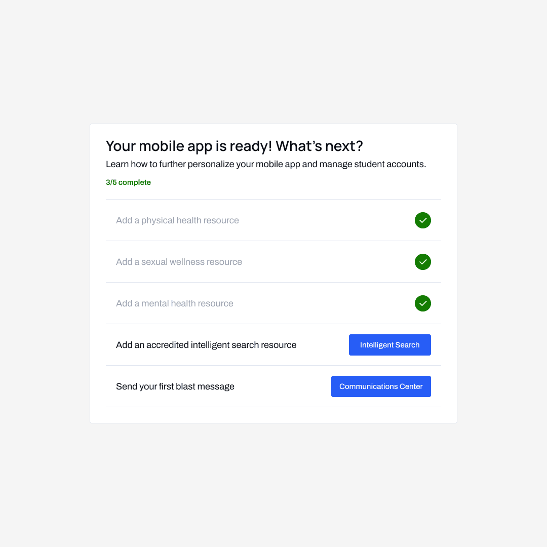
With Volta planning to rapidly expand to new schools (and new admin), our team decided that the most important was onboarding users onto the platform. The dashboard now includes a five-step onboarding checklist and tutorial videos for users who are looking for additional support.
Adding support for team-wide updates.
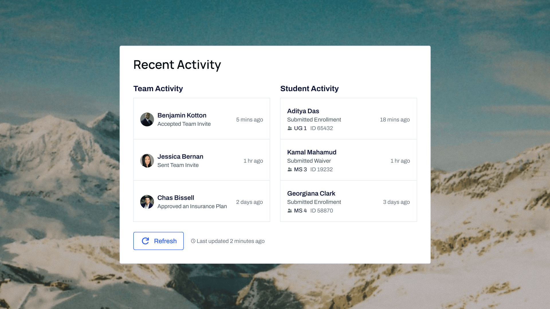
When I spoke to users and Volta's advising board of health professionals, I learned that a major pain point of the Volta's desktop platform was the inability for admin to see what their coworkers were up to.
Volta didn't have the bandwidth to prioritize creating an entire new page for detailed team updates. To address the feedback in the interim, I created a Recent Activity card for admin to see recent team and student updates. I worked closely with developers and my project manager to ensure that the card was feasible to implement within Volta's time frame.
Improving the utility of each individual component.
I improved the messages component to allow users to view their recently sent announcements. I also added a component that integrates with the user's calendar so they can see upcoming meetings for their day and plan their schedule accordingly.
"I was super worried that after we brought on [a new set of clients], we would be receiving tons of user support questions. But thankfully, that didn't happen. Users got the hang of [the product] much faster than before!"
—Bridgette Pereira, Head of Volta's Membership Team
Side Navigation
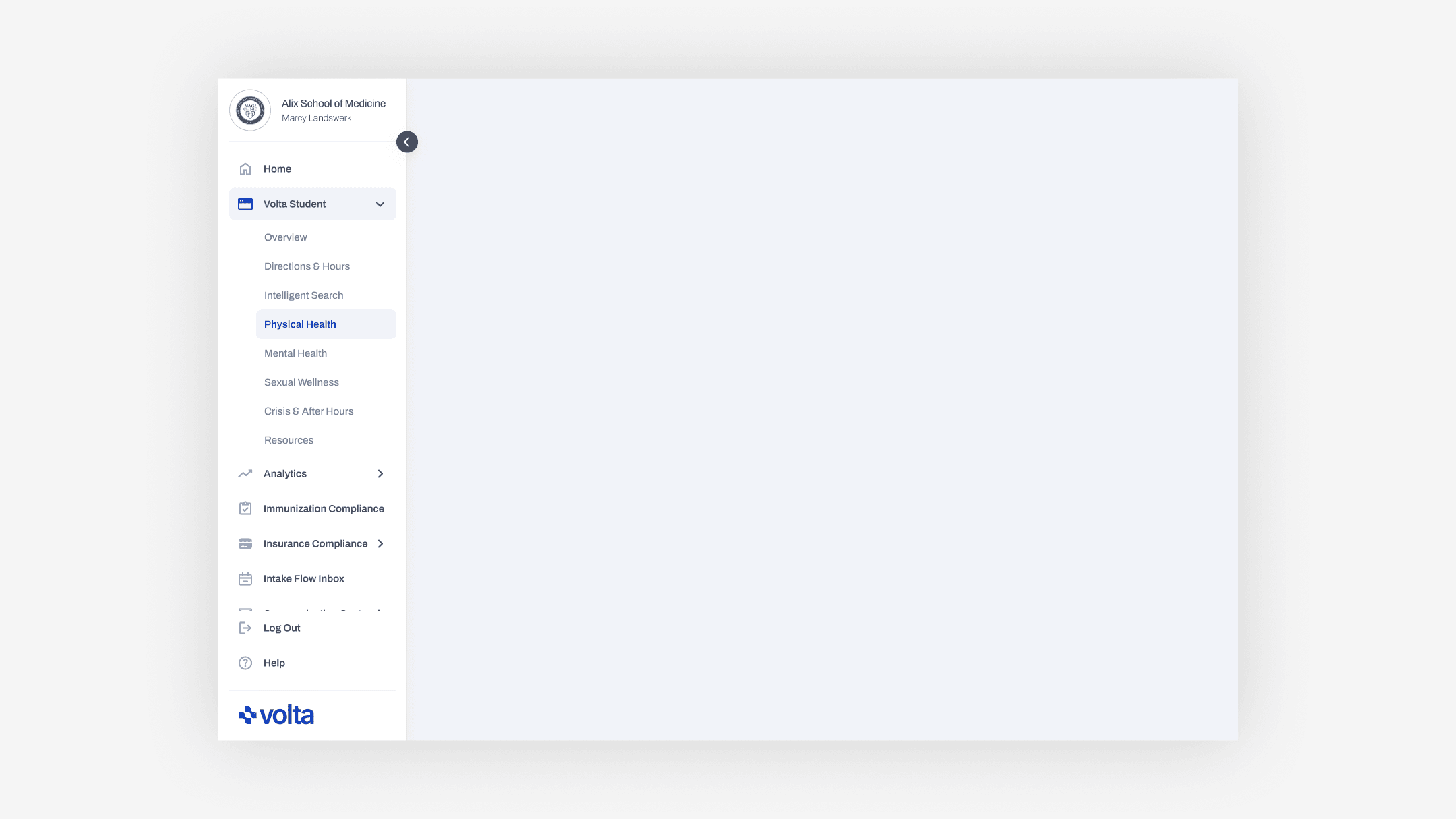
I also upgraded Volta's side navigation menu.
This was actually my first major project at Volta! When I joined the team, Volta's side navigation menu hadn't been updated to hide features that were not available in the clients' price plan. Beyond that, the old version of the menu was not very space-efficient, causing some ugly scrolling and breakpoint issues.
Before
Volta's old side navigation menu had some awkward overflows on standard desktop viewports.
Volta's old sidebar did not support their new subscription model, and had some awkward formatting problems.
Icons took up too much space, causing issues on smaller breakpoints.
While the icons for each menu item looked great, they came at the cost of making the menu significantly wider, and causing it to fall apart on tablets and small desktops.
Fixed content at the bottom of the sidenav cluttered the component.
The "Log Out" and "Help" tabs were nice to have at the bottom of the sidenav, but it broke common UX practices and led to some awkward vertical overflow issues. The logout option in particular felt strange to include in the menu in general, as admin rarely ever signed out of their Volta account.
The copy and formatting of the menu was unclear at times.
The top of the side navigation menu links to the users' account, but the header text of the button was the name of the university the admin worked for rather than the admin's name itself. This was a confusing and unintuitive label.
Above
It seems a little unnecessary to include the school's name in the profile button—admin already know what school they're working for.
After
My redesign of Volta's side navigation, which is responsive to standard desktop/tablet breakpoints.
Adding support for locked tabs.
When clicking on a locked tab in the side navigation, a small popover appears with a nudge to upgrade and unlock the feature. The popover includes a short demo video or thumbnail image of the feature.
Improved submenu navigation.
Unlike the previous iteration, Volta's submenu now smartly auto-collapses inactive submenus. Combined with thinner and more compact buttons, the menu no longer overflows on standard desktop and tablet screen sizes.
Process
I cycled through dozens of different ideas and iterations before shipping these projects.
I received tons of feedback from the design team at Volta, as well as from users and Volta's broader team and advising board. Here are some of the iterations that I cycled through when making the Next Steps component for the dashboard:
/
Iterations of the Next Steps component on the dashboard.
1 of 7
All of these iterations have pros and cons. Ultimately, the design team and I made a choice to prioritize clarity of information over slightly improved navigational utility.
As someone who loves obsessing over details in a design project, it was extremely fun to play around with space, coloring, and layout to see what cool things I could make within Volta's broader design system!
Conclusion
This work now exists in the hands of dozens of universities!
I want to thank the team again for supporting and mentoring me throughout my time. This position was really the one that made me realize how much I enjoyed designing interfaces. Not to mention, it taught me what it meant to ship a product to hundreds of thousands of users. Here are some of the key things I learned:
Sharing at every step of the way.
I used to be really self-conscious of sharing my works-in-progress, but doing daily stand-ups made me become comfortable sharing my projects along every step of the way.
Working within tight schedules.
As a relatively new start-up, Volta often had tight deadlines on when different things needed to be shipped. I learned how to be extremely organized and keep a project on schedule from start to finish.
The importance of good documentation.
With eight different developers, ten different advising board members, and two other product designers on the team, I learned the hard way how important it is to carefully document my work so nothing gets lost in translation!
Thanks for reading!
I'd like to give a huge shoutout to Kelly, Alana, Lubna, Tsikata, and the rest of the Volta team for your incredible mentorship. Thank you for taking a chance on me!